QuirksBlog - Viewports
.
The story goes as follows: Once upon a time there was a meta viewport property called user-scalable=no that suppressed pinch zoom on the page it was on. As a result users could not zoom in, even if they needed to. This was obviously a bad idea, and therefore browsers stopped supporting it.
At least, I thought that was the story. Turns out it isn’t.
continue reading
During the introduction of the iPhone X a hilarious gif made the Twitter rounds, showing a list scrolling past the new notch.
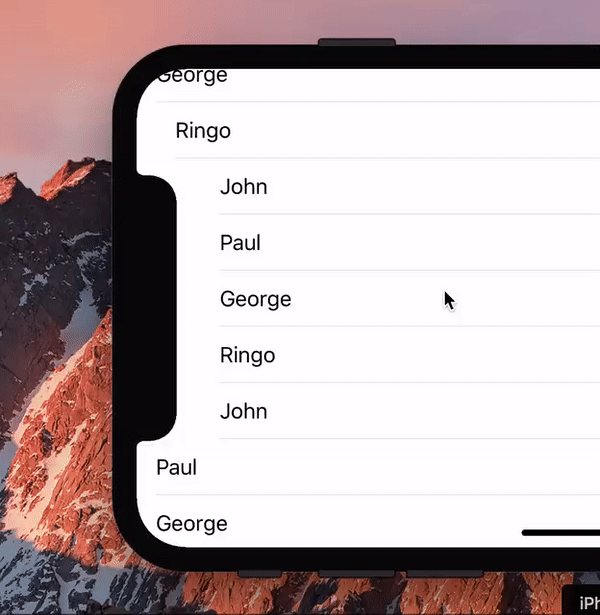
I asked the question any web developer would ask: “Hey, is this even possible with web technology?” Turns out it is.
(We should probably ask: “Hey, is this a useful effect, even if it’s possible?” But that’s a boring question, the answer being Probably Not.)
So for laughs I wrote a proof of concept (you need to load that into the iPhone X simulator). Turns out that this little exercise is quite useful for wrapping your head around the visual viewport and zooming. Also, the script turned out to be quite simple.
continue reading
A few weeks back the most exciting viewport news of the past few years broke: Chrome 61 supports a new visual viewport API. Although this new API is an excellent idea, and even includes a zoom event in disguise, the Chrome team decided that its existence warrants breaking old and trusty properties.
I disagree with that course of action, particularly because a better course is readily available: create a new layout viewport API similar to the visual one. Details below.
continue reading
All mobile browsers have two viewports. The layout viewport constrains your CSS — width: 100% means 100% of the layout viewport — while the visual viewport describes the area of the page the user is currently seeing. This visualisation of the two viewports might be useful as a reminder.
Today’s article studies what happens when these viewports change size. It also studies the resize event.
Some viewport changes are welcomed, such as the visual viewport resize after an orientation change or a zoom action. Others are esoteric, such as rewriting the meta viewport tag. Still others are seen as an annoyance, notably the appearance and disappearance of browser toolbars and the software keyboard.
(This article was originally published on Samsung Internet’s Medium channel. Since I do not believe Medium will survive in the long run I re-publish it here.)
continue reading
Three weeks ago I redid my mobile viewports tests for the umpteenth time, and today I give you my overview. There is some progress to report, but also a lot of changes.
Highlights:
screen.width/height now gives the dimensions of the ideal layout viewport in nearly all mobile browsers.getBoundingClientRect() is relative to the visual viewport in most browsers, but relative to the layout viewport in Chromium 50+ and Edge.Touch/Click.clientX/Y has the same problem: it is relative to the visual viewport in most browsers, but relative to the layout viewport in Chromium 45+ and Edge.Touch/Click.screenX/Y is still chaotic. Don’t use.- The Chromium WebView does not obey the meta viewport.
- I found a difference between Android WebKit the browser and Android WebKit the WebView. This is the first such difference I know of.
- I found a way of calculating the combined height of the browser and system toolbars in most browsers in some situations.
- We need more properties. A list can be found below.
continue reading
There we go again. The desktop browsers, over my strenuous objections, decided to treat DPR (device pixel ratio) as a variable instead of a constant when the user uses page zooming instead of pinch zooming.
The advantages or disadvantages of this decision are not what currently interests me, though I continue to have my doubts.
What we’re going to study today is the practical application of that idea: if DPR is a variable, responsive images should respond to page zoom. Do they? Safari doesn’t, Firefox does but has weird rounding, while Chrome/Opera and Edge each have their own bug but do normal rounding.
continue reading
Instead of the work I was supposed to do I spent about a day and a half on the alpha version of a viewports visualisation app that, oh irony of ironies, only works on desktop browsers because of the necessary space.
It’s already been very useful to me, since figuring out how the viewports actually work is necessary for full understanding. I hope it does the same for you.
It also contains an example of absolute, fixed, and device-fixed position so that you understand the difference.
The app is by no means ready; there’s a ton of features I’d like to add. Still, for now I’ve run out of time, and as long as it’s impossible to actually make money with such apps I’m not sure how much time I’m willing to spend on it.
Last week I found out that as of Chrome 48 window.innerWidth/Height no longer exposes the dimensions of the visual viewport. Instead, it now exposes the dimensions of the layout viewport, and is thus a copy of document.documentElement.clientWidth/Height.
I’m not happy with this change. So it’s time for me to don my ceremonial robes as Guardian of the Viewports and ask the Chrome team to revert this change and restore the visual viewport to its rightful place.
There are three reasons why I think Chrome is making a mistake here:
- It breaks the web. ALL other browsers support this.
- It takes one simple trick for web developers to avoid problems with these properties, so the change is not necessary.
- It chokes innovation, in particular zoom-based layouts.
continue reading
Back in April I lamented numerous problems and vaguenesses in the current W3C Device Adaptation spec. One of the spec’s editors, Florian Rivoal, contacted me, agreed that the spec had some problems, and explained some of its less clear features to me. In return, I explained some features I think should be added to the spec.
Within about ten mails we had agreed on the features that a future version of the spec should contain. This article summarises our conclusions, and adds a few questions a future version of the spec should answer.
Also, this article serves as a quick overview of where the viewports stand today. Everything described below works in almost all browsers right now, with the exception of the @viewport syntax. So this is useful reading for every web developer.
Finally, there’s one question that must be answered: If you use (x-based) responsive images on a desktop site, and the user zooms in, should you load the higher-DPR images? The answer is important for defining desktop DPR and screen.width/ height.
continue reading
After last week’s rant about, among other things, the W3C Device Adaptation spec, one of the spec’s authors asked me to clarify my critique. Fair enough. Here’s my take on the current specification.
My critique of Device Adaptation consists of three main themes:
- The spec does not address the actual current situation at all, while all browsers actually support my theory of the layout, visual, and ideal viewports decently, and I’ve already done the heavy lifting.
- The spec is obscure about what its most important components actually mean; I’m especially thinking of the initial and actual viewport. A simple schematic would have helped a lot here, and it’s fairly easy to produce.
- Although the spec treats relevant media queries as well as the meta viewport and the
@viewport syntax, it does not treat the relevant JavaScript properties such as window.innerWidth and devicePixelRatio. That latter, especially, could do with some specification.
continue reading
A friend of mine bought a fairly cheap (so probably not-too-new) Samsung smart TV to watch football, then promptly went on holiday with his family and asked me to feed the cat. In return I demanded the remote for the TV, and the manual (which turned out to be useless). So here’s my report of my first ever smart TV browser test.
continue reading
Desktop browsers have only one viewport: the browser window. In contrast, mobile browsers have three: layout, visual, and ideal. Why is that? What does it mean for the meta viewport, media queries, and all the rest? Why does responsive design work? (Not how. Why.) And how are the desktop browsers reacting to this series of new concepts coming from the mobile side?
continue reading
Just some random notes from the trenches in order to show everyone that, despite appearances, the viewport is not simple or easy to understand.
A browser vendor asked me to study the following problem:
- A page has width=device-width, or initial-scale=1, or both.
- The page also has an element of 1600px wide; far too wide for the layout viewport that’s normally created by the meta viewport.
- Should the browser zoom out in order to show the entire 1600px-wide element? Or should it ignore the wide element and show the usual result of 320-400px?
continue reading
Just a pointer: I created a quick and dirty overview table of where the mobile viewports and related concepts stand right now.
May be useful if you’re new to this sort of stuff.
Well, some discussion has certainly started about my first and second desktop media query bug reports. A redux is useful.
First, some good news. The way the resolution media query is currently behaving in Chrome is a bug, and it’s in the process of being fixed. That takes a load off my shoulders; for a moment I was afraid it was designed this way. But it’s not.
This does not say anything about the underlying issues I have with redefining DPR, though. Apart from the technical issues, there’s a cultural issue, if you wish. The discussions clarified my thinking and I can now describe it.
continue reading
I recently tested media queries in both mobile and desktop browsers, and found that the desktop browsers are making several serious mistakes in their implementation that threaten to pull apart the mobile and desktop worlds.
I feel the desktop browsers should defer to their mobile cousins in viewport matters, since mobile is the more complicated use case and a de-facto standard is emerging. Their recent actions threaten this process. The previous article treated rounding errors and problems with the width media query. This article will treat the very complicated DPR problem.
Briefly, desktop browsers recently changed the meaning of device-pixel-ratio to zoom level. I feel that this information should be moved to a new JavaScript property, media query, and JavaScript event, because squeezing it in with the existing mobile-based device-pixel-ratio properties and media queries has all kinds of odd consequences.
continue reading
I recently tested media queries in both mobile and desktop browsers, and found that the desktop browsers are making several serious mistakes in their implementation that threaten to pull apart the mobile and desktop worlds.
I feel that desktop browser makers have focused on desktop use cases too narrowly and failed to see that these changes introduce deliberate incompatibilities between desktop browsers and mobile browsers. It’s web developers who have to solve this mess, and it’s likely they can only do so by using browser detects.
continue reading
Yesterday I tested screen.width/height and related properties in the mobile browsers. The conclusion is that screen.width/height is completely unreliable.
There are two competing definitions of what screen.width/height actually means. In addition, a lot of browsers either ignore both definitions or have bugs in their implementation.
Thus, when analytics packages proudly present screen resolution stats, they don’t know what they’re talking about and you’d do best to ignore them. The package has no clue what kind of measurements it gets, but pastes the result into the database anyway and pretends it means something profound.
continue reading
I published my research on the orientationchange and resize events on mobile. If you’re expecting plenty of browser incompatibility fun you won’t be disappointed.
continue reading
Last week Luke Wroblewski published an important article in which he said that web developers practising responsive design rely too much on a device’s screen size to determine which device it is.
continue reading
Here’s an update to my recent viewport research about the height directive and the @viewport alternative syntax.
Summary: height doesn’t work. @viewport works only on Opera Presto, with the proper vendor prefix, which basically amounts to “doesn’t work.”
continue reading
Just now I released my preliminary meta viewport research that studies the various permutations of the <meta name="viewport"> tag.
It’s preliminary because I tested it in only eight browsers instead of the customary 40, I did not yet test the @viewport CSS rule, and I’ll probably need some extra tests to cover edge cases. Still, I now have a pretty good overview of where we stand with regard to the meta viewport.
continue reading
Turns out Tuesday’s post was not so much wrong as incomplete. I was tripped up by what’s probably the most complicated feature (or bug) in the meta viewport space, and my conclusions weren’t entirely correct.
Also see this post for the full research.
continue reading
One common problem on iOS is that, when you use a meta viewport tag with width=device-width, the page doesn’t react to an orientation change. On the iPhone the page becomes 320px wide and on the iPad 768px, regardless of whether you’re in portrait or in landscape mode. Sometimes this is annoying.
Today I found a solution: use initial-scale=1 instead of width=device-width. Although I’m not the first one to discover this (see, for instance, this article in French) it doesn’t seem that this solution is well-known.
See this post for an update, and this post for the full research.
continue reading
Last week I got annoyed at the large differences in syntax for vendor-prefixed device-pixel-ratio media queries. I said, half in desperation and half as a threat, that it might be better to have only the WebKit rendering engine and ditch the rest.
Meanwhile I’ve had some time to think about it, and I find that I still support the idea of multiple rendering engines. Competition is still good, just as it was ten years ago.
HOWEVER. There’s an important exception.
continue reading
It occurs to me that my recent post about devicePixelRatio was a bit cryptic and short. So I will givde some extra examples in this post. Also, I did some additional research that takes screen.width into account.
Remember the definition:
devicePixelRatio is the ratio between physical pixels and device-independent pixels (dips) on the device.
devicePixelRatio = physical pixels / dips
continue reading
I did some research around the window.devicePixelRatio property that all WebKit browsers, as well as Opera, support, and for once the news is good. This property’s definition makes sense, and it is implemented almost universally.
continue reading
Yesterday I finally researched window.outerWidth/Height in the mobile browsers, and here are my conclusions.
A few months back James Pearce published research that shows that the use of window.outerWidth on iOS devices allows you to read out the true orientation; something that screen.width does not.
Yesterday I came to the conclusion that this is far and away the most interesting use window.outerWidth has, and that James also missed a completely idiotic effect that Apple provides. The rest of the browsers are much more boring in their implementation.
continue reading
Last week I did some research on the resize event on mobile and tablet browsers. Executive summary: it’s a mess. And the best browser, surprisingly, is Samsung’s Dolfin.
My conclusions are, summarised:
continue reading
Yesterday James Pearce published important research into the nature and measuring of the mobile browser viewports. One finding is so important that I write this quick entry even though I haven’t yet fully researched it.
continue reading
On a hint from Vasilis I did some quick research into dynamically changing the meta viewport tag. Turns out that this works in nearly all browsers that support it in the first place, with the exception of Firefox. This entry gives the details and explains why you should care. See also the inevitable compatibility table.
continue reading
Web developers are quite annoyed that position: fixed doesn’t work on mobile browsers, but mobile browser vendors cannot afford to support it. This dilemma is unsolvable by the means we presently have at our disposal.
To offer a way out, I’m proposing to create a new position: device-fixed declaration better suited to the mobile scenario with its tiny screen and its zoom. The zoom aspect, in particular, is completely ignored by the spec, and so far mobile browsers haven’t found a good solution, either.
With a new value, fixed positioning could be split into a desktop and a mobile variant, and browsers could decide which one to support. That would allow web developers to devise separate solutions for desktop and mobile.
continue reading
As we all know, media queries are by far the best way to distinguish between desktop and mobile browsers, or, more generically, between the dozens of different screen sizes our users can have. Media queries are the future of the web.
Nonetheless, the fact that they are the future doesn’t mean that there are no problems. One is particularly tricky: what do we do for browsers that don’t support them?
continue reading
If you want to make your websites ready form mobile, it’s best to combine <meta name="viewport" content="width=device-width"> with width media queries. That will give your site the optimal width (as determined by the device vendor, who really ought to know), and your site will look the better for it.
Lanyrd, Simon and Natalie’s latest brainchild, uses exactly this technique, and it establishes the perfect mobile browsing baseline. Try it on as many mobile browsers as you can, and you’ll see. No frills, just a simple user experience that just works.
In order to understand why we should use exactly this combination we should briefly repeat what meta viewports and media queries are all about.
continue reading
On Tuesday Jason Grigsby challenged the conventional view that media queries are all we need to make a website mobile-friendly. Although he’s right when he points out some serious problems, I do not think that media queries are the “fool’s gold,” as Jason says. The message seems to be more that media queries alone are not enough to make your sites mobile-friendly. An additional component is required.
continue reading
About a month ago I release part one of my series “A tale of two viewports,” where I discuss the widths and heights of the viewport, the <html> element, and related issues on desktop browsers. Today I release part two, which deals with the mobile browsers. And of course there’s the inevitable compatibility table.
continue reading
Back in November I started complicated research into measuring the widths and heights of various
interesting elements in mobile browsers. This research kept me occupied for months and months; and frankly I became
a bit afraid of it because the subject is so complicated.
Besides, when I re-did some tests in March
I pretty quickly figured out I’d made some nasty mistakes in my original tests. Back to the
drawing board.
However, after a review round by some browser vendors and some rewriting it’s done now.
Today I present
A tale of two viewports — part one.
I explain CSS vs. device pixels, the viewport, several interesting JavaScript properties,
and the media queries width and device-width.
This piece is about the desktop browsers, because the mobile story is much easier to follow if you know
exactly what happens on desktop. Later on I’ll publish part two, which is exclusively about
mobile.
continue reading
Right now Jason Grigsby’s excellent summary of the orientation media query is making the round of blogs and tweets, and that’s well deserved. Media queries will become extremely important in the near future, when we have to build websites that work on any device resolution from 300px to 1280px or more.
Still, there’s one tiny nitpick I’d like to make, so that you fully understand when to use orientation and when to use device-width.
continue reading