Last week Krijn and I decided to cancel performance.now() 2021. Although it was the right decision it leaves me in financially fairly dire straits. So I’m looking for new jobs and/or donations....
Still, it also relieved me of a lot of money. This is the fourth conference in a row we cannot run, and I have burned through all my reserves. That’s why I thought I’d ask for help.
So ...
Has QuirksMode.org ever saved you a lot of time on a project? Did it advance your career? If so, now would be a great time to make a donation to show your appreciation.
I am trying my hand at CSS coaching. Though I had only few clients so far I found that I like it and would like to do it more. As an added bonus, because I’m still writing my CSS for JavaScripters book I currently have most of the CSS layout modules in my head and can explain them straight away — even stacking contexts.
Or if there’s any job you know of that requires a technical documentation writer with a solid knowledge of web technologies and the browser market, drop me a line. I’m interested.
Anyway, thanks for listening.
]]>I’m writing the position: sticky part of my book, and since I never worked with sticky before I’m not totally sure if what I’m saying is correct. This is made worse by the fact that there are no very clear...
position: sticky
part of my book, and since I never worked with sticky
before I’m not totally sure if what I’m saying is correct.
This is made worse by the fact that there are no very clear tutorials on sticky
. That’s partly because it works pretty intuitively in most cases, and partly because the details can be complicated.
position: sticky
. There will be something wrong with it; please correct me where needed.
The inset properties are top, right, bottom
and left
. (I already introduced this terminology earlier in the chapter.)
position: sticky
is a mix of relative
and fixed
. A sticky box takes its normal position in the flow, as if it had position: relative
, but if that position scrolls out of view the sticky box remains in a position defined by its inset properties, as if it has position: fixed
. A sticky box never escapes its container, though. If the container start or end scrolls past the sticky box abandons its fixed position and sticks to the top or the bottom of its container.
It is typically used to make sure that headers remain in view no matter how the user scrolls. It is also useful for tables on narrow screens: you can keep headers or the leftmost table cells in view while the user scrolls.
A sticky box needs a scroll box: a box that is able to scroll. By default this is the browser window — or, more correctly, the layout viewport — but you can define another scroll box by setting overflow
on the desired element. The sticky box takes the first ancestor that could scroll as its scroll box and calculates all its coordinates relative to it.
A sticky box needs at least one inset property. These properties contain vital instructions, and if the sticky box doesn’t receive them it doesn’t know what to do.
A sticky box may also have a container: a regular HTML element that contains the sticky box. The sticky box will never be positioned outside this container, which thus serves as a constraint.
The first example shows this set-up. The sticky <h2>
is in a perfectly normal <div>
, its container, and that container is in a <section>
that is the scroll box because it has overflow: auto
. The sticky box has an inset property to provide instructions. The relevant styles are:
section.scroll-container { border: 1px solid black; width: 300px; height: 300px; overflow: auto; padding: 1em; } div.container { border: 1px solid black; padding: 1em; } section.scroll-container h2 { position: sticky; top: 0; }
Regular content
Regular content
Regular content
Regular content
Regular content
Regular content
Regular content
Content outside container
Now let’s see exactly what’s going on.
A sticky box never escapes its containing box. If it cannot obey the rules that follow without escaping from its container, it instead remains at the edge. Scroll down until the container disappears to see this in action.
A sticky box starts in its natural position in the flow, as if it has position: relative
. It thus participates in the default flow: if it becomes higher it pushes the paragraphs below it downwards, just like any other regular HTML element. Also, the space it takes in the normal flow is kept open, even if it is currently in fixed position. Scroll down a little bit to see this in action: an empty space is kept open for the header.
A sticky box compares two positions: its natural position in the flow and its fixed position according to its inset properties. It does so in the coordinate frame of its scroll box. That is, any given coordinate such as top: 20px
, as well as its default coordinates, is resolved against the content box of the scroll box. (In other words, the scroll box’s padding also constrains the sticky box; it will never move up into that padding.)
A sticky box with top
takes the higher value of its top
and its natural position in the flow, and positions its top border at that value. Scroll down slowly to see this in action: the sticky box starts at its natural position (let’s call it 20px), which is higher than its defined top
(0). Thus it rests at its position in the natural flow. Scrolling up a few pixels doesn’t change this, but once its natural position becomes less than 0, the sticky box switches to a fixed layout and stays at that position.
The sticky box has bottom: 0
Regular content
Regular content
Regular content
Regular content
Regular content
Regular content
Content outside container
It does the same for bottom
, but remember that a bottom is calculated relative to the scroll box’s bottom, and not its top. Thus, a larger bottom coordinate means the box is positioned more to the top. Now the sticky box compares its default bottom with the defined bottom
and uses the higher value to position its bottom border, just as before.
With left
, it uses the higher value of its natural position and to position its left border; with
right
, it does the same for its right border, bearing in mind once more that a higher right
value positions the box more to the left.
If any of these steps would position the sticky box outside its containing box it takes the position that just barely keeps it within its containing box.
Very, very long line of content to stretch up the container quite a bit
Regular content
Regular content
Regular content
Regular content
Regular content
Regular content
Content outside container
The four inset properties act independently of one another. For instance the following box will calculate the position of its top and left edge independently. They can be relative or fixed, depending on how the user scrolls.
p.testbox { position: sticky; top: 0; left: 0; }
Content outside container
The sticky box has top: 0; bottom: 0
Regular content
Regular content
Regular content
Regular content
Regular content
Regular content
Regular content
Regular content
Regular content
Content outside container
Setting both a top and a bottom, or both a left and a right, gives the sticky box a bandwidth to move in. It will always attempt to obey all the rules described above. So the following box will vary between 0 from the top of the screen to 0 from the bottom, taking its default position in the flow between these two positions.
p.testbox { position: sticky; top: 0; bottom: 0; }
Regular content
Regular content
Regular content
Regular content
Regular content
Regular content
Regular content
Regular content
Regular content
Regular content
Regular content
So far we put the sticky box in a container separate from the scroll box. But that’s not necessary. You can also make the scroll box itself the container if you wish. The sticky element is still positioned with respect to the scroll box (which is now also its container) and everything works fine.
Regular content
Regular content
Regular content
Regular content
Regular content
Regular content
Regular content
Content outside container
Content outside outer container
Or the sticky item can be several containers removed from its scroll box. That’s fine as well; the positions are still calculated relative to the scroll box, and the sticky box will never leave its innermost container.
The container has overflow: auto
.
Regular content
Regular content
Regular content
Regular content
Regular content
Regular content
Content outside container
One feature that catches many people (including me) unaware is giving the container an overflow: auto
or hidden
. All of a sudden it seems the sticky header doesn’t work any more.
What’s going on here? An overflow
value of auto
, hidden
, or scroll
makes an element into a scroll box. So now the sticky box’s scroll box is no longer the outer element, but the inner one, since that is now the closest ancestor that is able to scroll.
The sticky box appears to be static, but it isn’t. The crux here is that the scroll box could scroll, thanks to its overflow
value, but doesn’t actually do so because we didn’t give it a height
, and therefore it stretches up to accomodate all of its contents.
Thus we have a non-scrolling scroll box, and that is the root cause of our problems.
As before, the sticky box calculates its position by comparing its natural position relative to its scroll box with the one given by its inset properties. Point is: the sticky box doesn’t scroll relative to its scroll box, so its position always remains the same. Where in earlier examples the position of the sticky element relative to the scroll box changed when we scrolled, it no longer does so, because the scroll box doesn’t scroll. Thus there is no reason for it to switch to fixed positioning, and it stays where it is relative to its scroll box.
The fact that the scroll box itself scrolls upward is irrelevant; this doesn’t influence the sticky box in the slightest.
One solution is to give the new scroll box a height
that is too little for its contents. Now the scroll box generates a scrollbar and becomes a scrolling scroll box. When we scroll it the position of the sticky box relative to its scroll box changes once more, and it switches from fixed to relative or vice versa as required.
Finally a few minor items:
position: -webkit-sticky
. All modern browsers support regular position: sticky
. (But if you need to cater to a few older browsers, retaining the double syntax doesn’t hurt.)Safari is holding back the web. It is the new IE, after all. In contrast, Chrome is pushing the web forward so hard that it’s starting to break. Meanwhile web developers do nothing except moan and complain. The only thing...
Recently there was yet another round of “Safari is the new IE” stories. Once Jeremy’s summary and a short discussion cleared my mind I finally figured out that Safari is not IE, and that Safari’s IE-or-not-IE is not the worst problem the web is facing.
Perry Sun argues that for developers, Safari is crap and outdated, emulating the old IE of fifteen years ago in this respect. He also repeats the theory that Apple is deliberately starving Safari of features in order to protect the app store, and thus its bottom line. We’ll get back to that.
The allegation that Safari is holding back web development by its lack of support for key features is not new, but it’s not true, either. Back fifteen years ago IE held back the web because web developers had to cater to its outdated technology stack. “Best viewed with IE” and all that. But do you ever see a “Best viewed with Safari” notice? No, you don’t. Another browser takes that special place in web developers’ hearts and minds.
Jorge Arango fears we’re going back to the bad old days with “Best viewed in Chrome.” Chris Krycho reinforces this by pointing out that, even though Chrome is not the standard, it’s treated as such by many web developers.
“Best viewed in Chrome” squares very badly with “Safari is the new IE.” Safari’s sad state does not force web developers to restrict themselves to Safari-supported features, so it does not hold the same position as IE.
So I propose to lay this tired old meme to rest. Safari is not the new IE. If anything it’s the new Netscape 4.
Meanwhile it is Chrome that is the new IE, but in reverse.
Back in the day, IE was accused of an embrace, extend, and extinguish strategy. After IE6 Microsoft did nothing for ages, assuming it had won the web. Thanks to web developers taking action in their own name for the first (and only) time, IE was updated once more and the web moved forward again.
Google learned from Microsoft’s mistakes and follows a novel embrace, extend, and extinguish strategy by breaking the web and stomping on the bits. Who cares if it breaks as long as we go forward. And to hell with backward compatibility.
Back in 2015 I proposed to stop pushing the web forward, and as expected the Chrome devrels were especially outraged at this idea. It never went anywhere. (Truth to tell: I hadn’t expected it to.)
I still think we should stop pushing the web forward for a while until we figure out where we want to push the web forward to — but as long as Google is in charge that won’t happen. It will only get worse.
A blog storm broke out over the decision to remove alert()
, confirm()
and prompt()
, first only the cross-origin variants, but eventually all of them.
Jeremy and Chris Coyier already summarised the situation, while Rich Harris discusses the uses of the three ancient modals, especially when it comes to learning JavaScript.
With all these articles already written I will only note that, if the three ancient modals are truly as horrendous a security issue as Google says they are it took everyone a bloody long time to figure that out. I mean, they turn 25 this year.
Although it appears Firefox and Safari are on board with at least the cross-origin part of the proposal, there is no doubt that it’s Google that leads the charge.
From Google’s perspective the ancient modals have one crucial flaw quite apart from their security model: they weren’t invented there. That’s why they have to be replaced by — I don’t know what, but it will likely be a very complicated API.
Thus the new embrace, extend, and extinguish is breaking backward compatibility in order to make the web more complicated. Nolan Lawson puts it like this:
we end up with convoluted specs like Service Worker that you need a PhD to understand, and yet we still don't have a working <dialog> element.
In addition, Google can be pretty arrogant and condescending, as Chris Ferdinandi points out.
The condescending “did you actually read it, it’s so clear” refrain is patronizing AF. It’s the equivalent of “just” or “simply” in developer documentation.
I read it. I didn’t understand it. That’s why I asked someone whose literal job is communicating with developers about changes Chrome makes to the platform.
This is not isolated to one developer at Chrome. The entire message thread where this change was surfaced is filled with folks begging Chrome not to move forward with this proposal because it will break all-the-things.
If you write documentation or a technical article and nobody understands it, you’ve done a crappy job. I should know; I’ve been writing this stuff for twenty years.
Extend, embrace, extinguish. And use lots of difficult words.
As a reaction to web dev outcry Google temporarily halted the breaking of the web. That sounds great but really isn’t. It’s just a clever tactical move.
I saw this tactic in action before. Back in early 2016 Google tried to break the de-facto standard for the mobile visual viewport that I worked very hard to establish. I wrote a piece that resonated with web developers, whose complaints made Google abandon the plan — temporarily. They tried again in late 2017, and I again wrote an article, but this time around nobody cared and the changes took effect and backward compatibility was broken.
So the three ancient modals still have about 12 to 18 months to live. Somewhere in late 2022 to early 2023 Google will try again, web developers will be silent, and the modals will be gone.
But why is Google breaking the web forward at such a pace? And why is Apple holding it back?
Safari is kept dumb to protect the app store and thus revenue. In contrast, the Chrome team is pushing very hard to port every single app functionality to the browser. Ages ago I argued we should give up on this, but of course no one listened.
When performing Valley Kremlinology, it is useful to see Google policies as stemming from a conflict between internal pro-web and anti-web factions. We web developers mainly deal with the pro-web faction, the Chrome devrel and browser teams. On the other hand, the Android team is squarely in the anti-web camp.
When seen in this light the pro-web camp’s insistence on copying everything appy makes excellent sense: if they didn’t Chrome would lag behind apps and the Android anti-web camp would gain too much power. While I prefer the pro-web over the anti-web camp, I would even more prefer the web not to be a pawn in an internal Google power struggle. But it has come to that, no doubt about it.
Is there any good solution? Not really.
Jim Nielsen feels that part of the issue is the lack of representation of web developers in the standardization process. That sounds great but is proven not to work.
Three years ago Fronteers and I attempted to get web developers represented and were met with absolute disinterest. Nobody else cared even one shit, and the initiative sank like a stone.
So a hypothetical web dev representative in W3C is not going to work. Also, the organisational work would involve a lot of unpaid labour, and I, for one, am not willing to do it again. Neither is anyone else. So this is not the solution.
And what about Firefox? Well, what about it? Ten years ago it made a disastrous mistake by ignoring the mobile web for way too long, then it attempted an arrogant and uninformed come-back with Firefox OS that failed, and its history from that point on is one long slide into obscurity. That’s what you get with shitty management.
So Safari is trying to slow the web down. With Google’s move-fast-break-absofuckinglutely-everything axiom in mind, is Safari’s approach so bad?
Regardless of where you feel the web should be on this spectrum between Google and Apple, there is a fundamental difference between the two.
We have the tools and procedures to manage Safari’s disinterest. They’re essentially the same as the ones we deployed against Microsoft back in the day — though a fundamental difference is that Microsoft was willing to talk while Apple remains its old haughty self, and its “devrels” aren’t actually allowed to do devrelly things such as managing relations with web developers. (Don’t blame them, by the way. If something would ever change they’re going to be our most valuable internal allies — just as the IE team was back in the day.)
On the other hand, we have no process for countering Google’s reverse embrace, extend, and extinguish strategy, since a section of web devs will be enthusiastic about whatever the newest API is. Also, Google devrels talk. And talk. And talk. And provide gigs of data that are hard to make sense of. And refer to their proprietary algorithms that “clearly” show X is in the best interest of the web — and don’t ask questions! And make everything so fucking complicated that we eventually give up and give in.
So pick your poison. Shall we push the web forward until it’s broken, or shall we break it by inaction? What will it be? Privately, my money is on Google. So we should say goodbye to the old web while we still can.
]]>You’re reading a failed article. I hoped to write about @property and how it is useful for extending CSS inheritance considerably in many different circumstances. Alas, I failed. @property turns out to be very useful for font sizes, but does...
@property
and how it is useful for extending CSS inheritance considerably in many different circumstances. Alas, I failed. @property
turns out to be very useful for font sizes, but does not even approach the general applicability I hoped for.
]]>
It all started when I commented on what I thought was an interesting but theoretical idea by Lea Verou: what if elements could inherit the font size of not their parent, but their grandparent? Something like this:
div.grandparent { /* font-size could be anything */ } div.parent { font-size: 0.4em; } div.child { font-size: [inherit from grandparent in some sort of way]; font-size: [yes, you could do 2.5em to restore the grandparent's font size]; font-size: [but that's not inheriting, it's just reversing a calculation]; font-size: [and it will not work if the parent's font size is also unknown]; }
Lea told me this wasn’t a vague idea, but something that can be done right now. I was quite surprised — and I assume many of my readers are as well — and asked for more information. So she wrote Inherit ancestor font-size, for fun and profit, where she explained how the new Houdini @property
can be used to do this.
This was seriously cool. Also, I picked up a few interesting bits about how CSS custom properties and Houdini @property
work. I decided to explain these tricky bits in simple terms — mostly because I know that by writing an explanation I myself will understand them better — and to suggest other possibilities for using Lea’s idea.
Alas, that last objective is where I failed. Lea’s idea can only be used for font sizes. That’s an important use case, but I had hoped for more. The reasons why it doesn’t work elsewhere are instructive, though.
Let’s consider CSS custom properties. What if we store the grandparent’s font size in a custom property and use that in the child?
div.grandparent { /* font-size could be anything */ --myFontSize: 1em; } div.parent { font-size: 0.4em; } div.child { font-size: var(--myFontSize); /* hey, that's the grandparent's font size, isn't it? */ }
This does not work. The child will have the same font size as the parent, and ignore the grandparent. In order to understand why we need to understand how custom properties work. What does this line of CSS do?
--myFontSize: 1em;
It sets a custom property that we can use later. Well duh.
Sure. But what value does this custom property have?
... errr ... 1em?
Nope. The answer is: none. That’s why the code example doesn’t work.
When they are defined, custom properties do not have a value or a type. All that you ordered the browsers to do is to store a token in the variable --myFontSize
.
This took me a while to wrap my head around, so let’s go a bit deeper. What is a token? Let’s briefly switch to JavaScript to explain.
let myVar = 10;
What’s the value of myVar
in this line? I do not mean: what value is stored in the variable myVar
, but: what value does the character sequence myVar
have in that line of code? And what type?
Well, none. Duh. It’s not a variable or value, it’s just a token that the JavaScript engine interprets as “allow me to access and change a specific variable” whenever you type it.
CSS custom properties also hold such tokens. They do not have any intrinsic meaning. Instead, they acquire meaning when they are interpreted by the CSS engine in a certain context, just as the myVar
token is in the JavaScript example.
So the CSS custom property contains the token 1em
without any value, without any type, without any meaning — as yet.
You can use pretty any bunch of characters in a custom property definition. Browsers make no assumptions about their validity or usefulness because they don’t yet know what you want to do with the token. So this, too, is a perfectly fine CSS custom property:
--myEgoTrip: ppk;
Browsers shrug, create the custom property, and store the indicated token. The fact that ppk
is invalid in all CSS contexts is irrelevant: we haven’t tried to use it yet.
It’s when you actually use the custom property that values and types are assigned. So let’s use it:
background-color: var(--myEgoTrip);
Now the CSS parser takes the tokens we defined earlier and replaces the custom property with them:
background-color: ppk;
And only NOW the tokens are read and intrepreted. In this case that results in an error: ppk is not a valid value for background-color. So the CSS declaration as a whole is invalid and nothing happens — well, technically it gets the unset
value, but the net result is the same. The custom property itself is still perfectly valid, though.
The same happens in our original code example:
div.grandparent { /* font-size could be anything */ --myFontSize: 1em; /* just a token; no value, no meaning */ } div.parent { font-size: 0.4em; } div.child { font-size: var(--myFontSize); /* becomes */ font-size: 1em; /* hey, this is valid CSS! */ /* Right, you obviously want the font size to be the same as the parent's */ /* Sure thing, here you go */ }
In div.child
he tokens are read and interpreted by the CSS parser. This results in a declaration font-size: 1em;
. This is perfectly valid CSS, and the browsers duly note that the font size of this element should be 1em.
font-size: 1em
is relative. To what? Well, to the parent’s font size, of course. Duh. That’s how CSS font-size
works.
So now the font size of the child becomes the same as its parent’s, and browsers will proudly display the child element’s text in the same font size as the parent element’s while ignoring the grandparent.
This is not what we wanted to achieve, though. We want the grandparent’s font size. Custom properties — by themselves — don’t do what we want. We have to find another solution.
Lea’s article explains that other solution. We have to use the Houdini @property
rule.
@property --myFontSize { syntax: "<length>"; initial-value: 0; inherits: true; } div { border: 1px solid; padding: 1em; } div.grandparent { /* font-size could be anything */ --myFontSize: 1em; } div.parent { font-size: 0.4em; } div.child { font-size: var(--myFontSize); }
Now it works. Wut? Yep — though only in Chrome so far.
What black magic is this?
Adding the @property
rule changes the custom property --myFontSize
from a bunch of tokens without meaning to an actual value. Moreover, this value is calculated in the context it is defined in — the grandfather — so that the 1em
value now means 100% of the font size of the grandfather. When we use it in the child it still has this value, and therefore the child gets the same font size as the grandfather, which is exactly what we want to achieve.
(The variable uses a value from the context it’s defined in, and not the context it’s executed in. If, like me, you have a grounding in basic JavaScript you may hear “closures!” in the back of your mind. While they are not the same, and you shouldn’t take this apparent equivalency too far, this notion still helped me understand. Maybe it’ll help you as well.)
Unfortunately I do not quite understand what I’m doing here, though I can assure you the code snippet works in Chrome — and will likely work in the other browsers once they support @property
.
Misson completed — just don’t ask me how.
You have to get the definition right. You need all three lines in the @property
rule. See also the specification and the MDN page.
@property --myFontSize { syntax: "<length>"; initial-value: 0; inherits: true; }
The syntax
property tells browsers what kind of property it is and makes parsing it easier. Here is the list of possible values for syntax
, and in 99% of the cases one of these values is what you need.
You could also create your own syntax, e.g.
syntax: "ppk | <length>"
Now the ppk
keyword and any sort of length is allowed as a value.
Note that percentages are not lengths — one of the many things I found out during the writing of this article. Still, they are so common that a special value for “length that may be a percentage or may be calculated using percentages” was created:
syntax: "<length-percentage>"
Finally, one special case you need to know about is this one:
syntax: "*"
MDN calls this a universal selector, but it isn’t, really. Instead, it means “I don’t know what syntax we’re going to use” and it tells browsers not to attempt to interpret the custom property. In our case that would be counterproductive: we definitely want the 1em
to be interpreted. So our example doesn’t work with syntax: "*"
.
An initial-value
property is required for any syntax value that is not a *
. Here that’s simple: just give it an initial value of 0 — or 16px, or any absolute value. The value doesn’t really matter since we’re going to overrule it anyway. Still, a relative value such as 1em
is not allowed: browsers don’t know what the 1em would be relative to and reject it as an initial value.
Finally, inherits: true
specifies that the custom property value can be inherited. We definitely want the computed 1em
value to be inherited by the child — that’s the entire point of this experiment. So we carefully set this flag to true
.
So far this article merely rehashed parts of Lea’s. Since I’m not in the habit of rehashing other people’s articles my original plan was to add at least one other use case. Alas, I failed, though Lea was kind enough to explain why each of my ideas fails.
Could we grandfather-inherit percentual margins and paddings? They are relative to the width of the parent of the element you define them on, and I was wondering if it might be useful to send the grandparent’s margin on to the child just like the font size. Something like this:
@property --myMargin { syntax: "<length-percentage>"; initial-value: 0; inherits: true; } div.grandparent { --myMargin: 25%; margin-left: var(--myMargin); } div.parent { font-size: 0.4em; } div.child { margin-left: var(--myMargin); /* should now be 25% of the width of the grandfather's parent */ /* but isn't */ }
Alas, this does not work. Browsers cannot resolve the 25%
in the context of the grandparent, as they did with the 1em
, because they don’t know what to do.
The most important trick for using percentages in CSS is to always ask yourself: “percentage of WHAT?”
That’s exactly what browsers do when they encounter this @property
definition. 25% of what? The parent’s font size? Or the parent’s width? (This is the correct answer, but browsers have no way of knowing that.) Or maybe the width of the element itself, for use in background-position
?
Since browsers cannot figure out what the percentage is relative to they do nothing: the custom property gets the initial value of 0 and the grandfather-inheritance fails.
Another idea I had was using this trick for the grandfather’s text colour. What if we store currentColor
, which always has the value of the element’s text colour, and send it on to the grandchild? Something like this:
@property --myColor { syntax: "<color>"; initial-value: black; inherits: true; } div.grandparent { /* color unknown */ --myColor: currentColor; } div.parent { color: red; } div.child { color: var(--myColor); /* should now have the same color as the grandfather */ /* but doesn't */ }
Alas, this does not work either. When the @property
blocks are evaluated, and 1em
is calculated, currentColor
specifically is not touched because it is used as an initial (default) value for some inherited SVG and CSS properties such as fill
. Unfortunately I do not fully understand what’s going on, but Tab says this behaviour is necessary, so it is.
Pity, but such is life. Especially when you’re working with new CSS functionalities.
So I tried to find more possbilities for using Lea’s trick, but failed. Relative units are fairly sparse, especially when you leave percentages out of the equation. em
and related units such as rem
are the only ones, as far as I can see.
So we’re left with a very useful trick for font sizes. You should use it when you need it (bearing in mind that right now it’s only supported in Chromium-based browsers), but extending it to other declarations is not possible at the moment.
Many thanks to Lea Verou and Tab Atkins for reviewing and correcting an earlier draft of this article.
]]>Let’s talk about money! Let’s talk about how hard it is to pay small amounts online to people whose work you like and who could really use a bit of income. Let’s talk about how Coil aims to change that....
Let’s talk about how hard it is to pay small amounts online to people whose work you like and who could really use a bit of income. Let’s talk about how Coil aims to change that.
]]> Taking a subscription to a website is moderately easy, but the person you want to pay must have enabled them. Besides, do you want to purchase a full subscription in order to read one or two articles per month?Sending a one-time donation is pretty easy as well, but, again, the site owner must have enabled them. And even then it just gives them ad-hoc amounts that they cannot depend on.
Then there’s Patreon and Kickstarter and similar systems, but Patreon is essentially a subscription service while Kickstarter is essentially a one-time donation service, except that both keep part of the money you donate.
And then there’s ads ... Do we want small content creators to remain dependent on ads and thus support the entire ad ecosystem? I, personally, would like to get rid of them.
The problem today is that all non-ad-based systems require you to make conscious decisions to support someone — and even if you’re serious about supporting them you may forget to send in a monthly donation or to renew your subscription. It sort-of works, but the user experience can be improved rather dramatically.
That’s where Coil and the Web Monetization Standard come in.
The idea behind Coil is that you pay for what you consume easily and automatically. It’s not a subscription - you only pay for what you consume. It’s not a one-time donation, either - you always pay when you consume.
Payments occur automatically when you visit a website that is also subscribed to Coil, and the amount you pay to a single site owner depends on the time you spend on the site. Coil does not retain any of your money, either — everything goes to the people you support.
In this series of four articles we’ll take a closer look at the architecture of the current Coil implementation, how to work with it right now, the proposed standard, and what’s going to happen in the future.
So how does Coil work right now?
Both the payer and the payee need a Coil account to send and receive money. The payee has to add a <meta>
tag with a Coil payment pointer to all pages they want to monetize. The payer has to install the Coil extension in their browsers. You can see this extension as a polyfill. In the future web monetization will, I hope, be supported natively in all browsers.
Once that’s done the process works pretty much automatically. The extension searches for the <meta>
tag on any site the user visits. If it finds one it starts a payment stream from payer to payee that continues for as long as the payer stays on the site.
The payee can use the JavaScript API to interact with the monetization stream. For instance, they can show extra content to paying users, or keep track of how much a user paid so far. Unfortunately these functionalities require JavaScript, and the hiding of content is fairly easy to work around. Thus it is not yet suited for serious business purposes, especially in web development circles.
This is one example of how the current system is still a bit rough around the edges. You’ll find more examples in the subsequent articles. Until the time browsers support the standard natively and you can determine your visitors’ monetization status server-side these rough bits will continue to exist. For the moment we will have to work with the system we have.
This article series will discuss all topics we touched on in more detail.
For too long we have accepted free content as our birthright, without considering the needs of the people who create it. This becomes even more curious for articles and documentation that are absolutely vital to our work as web developers.
Take a look at this list of currently-monetized web developer sites. Chances are you’ll find a few people whose work you used in the past. Don’t they deserve your direct support?
Free content is not a right, it’s an entitlement. The sooner we internalize this, and start paying independent voices, the better for the web.
The only alternative is that all articles and documentation that we depend on will written by employees of large companies. And employees, no matter how well-meaning, will reflect the priorities and point of view of their employer in the long run.
So start now.
In order to support them you should invest a bit of time once and US$5 per month permanently. I mean, that’s not too much to ask, is it?
I wrote this article and its sequels for Coil, and yes, I’m getting paid. Still, I believe in what they are doing, so I won’t just spread marketing drivel. Initially it was unclear to me exactly how Coil works. So I did some digging, and the remaining parts of this series give a detailed description of how Coil actually works in practice.
For now the other three articles will only be available on dev.to. I just published part 2, which gives a high-level overview of how Coil works right now. Part 3 will describe the meta tag and the JavaScript API, and in part 4 we’ll take a look at the future, which includes a formal W3C standard. Those parts will be published next week and the week after that.
]]>Today we’re going to take a quick look at a few special CSS keywords you can use on any CSS property: inherit, initial, revert, and unset. Also, we will ask where and when to use them to the greatest effect,...
inherit
, initial
, revert
, and unset
. Also, we will ask where and when to use them to the greatest effect, and if we need more of those keywords.
The first three were defined in the Cascading Level 3 spec, while revert
was added in Cascading Level 4. Despite 4 still being in draft revert
is already supported.
See also
the MDN revert page,
Chris Coyier’s page,
and my test page
The inherit
keyword explicitly tells an element that it inherits the value for this declaration from its parent. Let’s take this example:
.my-div { margin: inherit; } .my-div a { color: inherit; }
The second declaration is easiest to explain, and sometimes actually useful. It says that the link colour in the div should be the same as the text colour. The div has a text colour. It’s not specified here, but because color
is inherited by default the div gets the text color of its parent. Let’s say it’s black.
Links usually have a different colour. As a CSS programmer you frequently set it, and even if you don’t browsers automatically make it blue for you. Here, however, we explicitly tell the browsers that the link colour should be inherited from its parent, the div. In our example links become black.
(Is this a good idea? Occasionally. But if you remove the colour difference between links and main text, make sure your links are underlined. Your users will thank you.)
Now let’s look at the margin: inherit
. Normally margins don’t inherit, and for good reason. The fact that an element has margin-left: 10%
does not mean all of its descendents should also get that margin. In fact, you most likely don’t want that. Margins are set on a per-case basis.
This declaration tells the div to use the margin specified on its parent, however. This is an odd thing to specify, and I never saw a practical use case in the wild. Still CSS, being ridiculously powerful, allows it.
In any case, that’s how the inherit
keyword works. Using it for font sizes or colours may occasionally be a good idea. In other contexts - rarely.
And keep the difference between inheriting and non-inheriting properties in mind. It’s going to be important later on.
The initial
keywords sets the property back to its initial value. This is the value specified in the W3C specification for that property.
Initial values from the spec are a bit of a mixed bag. Some make sense, others don’t, really. float: none
and background-color: transparent
are examples of the first category. Of course an element does not have a background colour without you specifying one, nor does it float automatically.
Others are historically determined, such as background-repeat: repeat
. Back in the Stone Age before CSS all background images repeated, and the CSS1 specification naturally copied this behaviour.
Still others are essentially arbitrary, such as display: inline
. Why did W3C opt for inline instead of block? I don’t know, and it doesn’t really matter any more. They had to decide on an initial value, and while inline is somewhat strange, block would be equally strange.
In any case, the initial
keyword makes the property revert to this initial value from the specification, whether that makes sense or not.
When we get to the unset
value the distinction between inheriting and non-inheriting properties becomes important. unset
has a different effect on them.
unset
means inherit
.unset
means initial
.revert
, the newest of these keywords, also distinguishes between inheriting and non-inheriting properties.
revert
means inherit
.revert
reverts to the value specified in the browser style sheet.Finally, we should treat all
. It is not a value but a property, or rather, the collection of all CSS properties on an element. It only takes one of the keywords we discussed, and allows you to apply that keyword to all CSS properties. For instance:
.my-div { all: initial; }
Now all CSS properties on the div are set to initial
.
The reaction of my test page to setting the display
of all elements to the four keywords is instructive. My test script sets the following style:
body * { display: [inherit | initial | unset | revert] !important; }
The elements react as follows:
display: inherit
: all elements now inherit their display value from the body. Since the body has display: block
all elements get that value, whether that makes sense or not.display: initial
: the initial value of display is inline
. Therefore all elements get that value, whether that makes sense or not.display: unset
: display does not inherit. Therefore this behaves as initial
and all elements get display: inline
.display: revert
: display does not inherit. Therefore the defaults of the browser style sheet are restored, and each element gets its proper display — except for the dl
, which I had given a display: grid
. This value is now supplanted by the browser-provided block
.Unfortunately the same test page also contains a riddle I don’t understand the behaviour of <button>
s when I set color
to the four keywords:
color: inherit
: all elements, including <button>
s, now inherit their colour from the body, which is blue
. So all text becomes blue.color: initial
: since the initial value of color
is black, all elements, including <button>
s, become black.color: unset
: color inherits. Therefore this behaves as inherit
and all elements, including <button>
s, become blue.color: revert
: This is the weird one. All elements become blue, except for <button>
s, which become black. I don’t understand why. Since colors inherit, I expected revert
to work as inherit
and the buttons to also become blue. But apparently the browser style sheet of button {color: black}
(more complicated in practice) is given precedence. Yes, revert
should remove author styles (the ones we write), and that would cause the black from the browser style sheet to be applied, but only if a property does not inherit — and color does. I don’t know why the browser style sheet is given precedence in this case. So I’m going to cop out and say form elements are weird.The purpose of both unset
and revert
is to wipe the slate clean and return to the initial and the browser styles, respectively — except when the property inherits; in that case, inheritance is still respected. initial
, meanwhile, wipes the slate even cleaner by also reverting inheriting properties to their initial values.
This would be useful when you create components that should not be influenced by styles defined elsewhere on the page. Wipe the slate clean, start styling from zero. That would help modularisation.
But that’s not how these keywords work. We don’t want to revert to the initial styles (which are sometimes plain weird) but to the browser style sheet. unset
comes closest, but it doesn’t touch inherited styles, so it only does half of what we want.
So right now these keywords are useless — except for inherit
in a few specific situations usually having to do with font sizes and colours.
Chris Coyier argues we need a new value which he calls default
. It reverts to the browser style sheet in all cases, even for inherited properties. Thus it is a stronger version of revert
. I agree. This keyword would be actually useful. For instance:
.my-component,.my-component * { all: default; font-size: inherit; font-family: inherit; color: inherit; }
Now we have a component that’s wiped clean, except that we decide to keep the fonts and colour of the main page. The rest is a blank slate that we can style as we like. That would be a massive boon to modularisation.
For years now I have had the feeling that we need yet another keyword, which I’ll call cascade
for now. It would mean “take the previous value in the cascade and apply it here.” For instance:
.my-component h2 { font-size: 24px; } .my-other-component h2 { font-size: 3em; } h2#specialCase { font-size: clamp(1vw,cascade,3vw) }
In this (slightly contrived) example I want to clamp the font-size of a special h2 between 1vw and 3vw, with the preferred value being the one defined for the component I’m working in. Here, cascade
would mean: take the value the cascade would deliver if this rule didn’t exist. This would make the clamped font size use either 24px or 3em as its preferred value, depending on which component we’re in.
The problem with this example is that it could also use custom properties. Just set --h2size
to either 24px or 3em, use it in the clamp, and you’re done.
.my-component h2 { --h2size: 24px; font-size: var(--h2size); } .my-other-component h2 { --h2size: 3em; font-size: var(--h2size); } h2#specialCase { font-size: clamp(1vw,var(--h2size),3vw) }
Still, this is but the latest example I created. I have had this thought many, many times, but because I didn’t keep track of my use cases I’m not sure if all of them could be served by custom properties.
Also, suppose you inherit a very messy CSS code base with dozens of components written at various skill levels. In that case adding custom properties to all components might be impractical, and the cascade
keyword might help.
Anyway, I barely managed to convince myself, so professional standard writers will certainly not be impressed. Still, I thought I’d throw it out here to see if anyone else has a use case for cascade
that cannot be solved with custom properties.
This week we’ll take a look at the new aspect-ratio declaration and its use. Una Kravets wrote the introductory article, but there are some additional technical points to be made. I also wrote a little fallback that you might use...
aspect-ratio
declaration and its use. Una Kravets wrote the introductory article, but there are some additional technical points to be made. I also wrote a little fallback that you might use if you need aspect-ratio
right now.
]]>
At the time of writing aspect-ratio
is supported by Chrome 90, by Safari Technology Preview, and by Firefox 88 if you set the aspect-ratio flag in about:config. You need one of these browsers to see the examples below — except for the fallback, which should work in all browsers that support custom properties.
aspect-ratio
defines the ratio between the width and height of a box, but it is a weak declaration. If the box has a specified width and height the browser uses those values and ignores the aspect ratio. Width and height might be specified by explicit width
and height
declarations or by other means, as we’ll see below.
In this example all three boxes have aspect-ratio: 16/9
.
The first box has width: auto; height: auto
; i.e. as much width as you can take, and as little height as you need. aspect-ratio
takes the width, converts it to pixels, and applies the defined aspect ratio to calculate the height.
The second box has a height: 50px; width: auto
. The height is strong, but the auto width is weak and allows aspect-ratio
to override it. Thus the box’s width is calculated by taking the height and applying the aspect ratio.
The third box has a fixed width: 150px; height: 100px
as well as an aspect-ratio: 16/9
. Now both width and height are strong and the aspect ratio is ignored.
Even if aspect-ratio
works fine the browser must find an integer number of device pixels for the box’s width and height. Fractions are discarded somewhere along the way. That’s why the calculated aspect ratio of a box is rarely 100% exact. In the examples you’ll often see a narrow stripe of red poking from underneath the background image. That image has the same aspect ratio as the box it appears in, but apparently uses a different calculation. In normal circumstances these tiny differences are not visible to the naked eye, so you can safely ignore them.
Fat red stripes, such as in the last box in the first example, are a sign of trouble, though.
You can set a min/max-width/height
on the boxes. These are obeyed as normal, and aspect-ratio
is obeyed as well. In this example the first box has a min-height: 100px
, the second a max-height: 50px
, and the third min-width: 100px
. As you see they stretch up or down to their defined maximum and minimum and retain their aspect-ratio
.
Now we come to a trickier topic unearthed originally by Ana Tudor — and this entire article is a good read that I recommend.
If it works, aspect-ratio
sets either the width or the height of a box to match the other side and the defined aspect ratio. However, the exact effect depends on how width and height are defined; on box-sizing
, in other words.
width
may mean either the content width, without padding and border (box-sizing: content-box
; the default), or the width of content + padding + border (box-sizing: border-box
). In general, the latter is what we want.
In the next example the boxes have padding: 10%
. Percentual padding is always calculated relative to the width of the parent element. Thus this box has a padding of 10% of its parent element’s width, even at the top and the bottom.
Since the padding is equal on all four sides, it may break the box’s aspect ratio. This depends on box-sizing
. If you use the default box-sizing: content-box
the width and height have the correct aspect ratio, but they define only the content area. An equal amoung of padding is added on all sides, and the aspect ratio is destroyed.
This problem is easy to solve: set box-sizing: border-box
. Now width and height define the content, padding, and border combined, and this entire area is given the correct aspect ratio. Thus the padding is seamlessly integrated with the proper aspect ratio.
In fact, you should always set box-sizing: border-box
in all your sites. content-box
was a mistake, as W3C itself admitted (and as I said back in 2002). The fact that it fixes aspect-ratio
merely gives us an extra reason to do so.
In a flex or grid context, aspect-ratio
can appear not to work. In fact, running into these problems was what caused me to write this article in the first place.
Look at the example below. It doesn’t work! Oh noesies! What’s going on?
What happens here is default flexbox behaviour. First the widths of the items are calculated (here from flex-basis: 30%; grow: 1
), and once that’s done the height of all items is set. These heights are calculated by applying their aspect ratio, but the tallest box is used to set the height of all items in the row. In our example that is the 1/1 box, so the 16/9 and 4/3 boxes also have an aspect ratio of 1/1.
This default behaviour is ruled by align-items: stretch
, which is part of the flexbox default. If you use any other value the boxes’ height
is set to auto and they take their proper aspect ratio. flex-start
is the most obvious choice, but see CSS Tricks’ great flexbox guide for more options.
If for some reason you want to overrule the height stretch on only a single item you can give that item either align-self: flex-start
or any other value, or height: min-content
. Both work fine. The third box in the next example has height: min-content
.
In a grid context aspect-ratio
encounters the same problems as in a flexbox environment, only with added browser bugs that I wrote about last week. I expected the same behaviour as in a flexbox context, but that’s not entirely what’s happening.
The good news is that align-items
, align-self
, and height: min-content
all work exactly as with flexbox. They negate the default grid behaviour of stretching the height of all elements in a row to the height of the highest element.
The problems are in the default rendering of aspect-ratio
. Chrome and Safari implement this in one incorrect way, and Firefox is a quite different, equally incorrect way.
If all boxes in the example below have the same width and height the bugs have been solved. They get the same height for the reasons I explained under flexbox — grid works the same in this respect (I hope).
Firefox obeys the aspect-ratio
while I think it shouldn’t. Instead, like in the flexbox example, it should stretch the boxes to the height of the highest in the row. In addition it calculates the height of the entire grid by assuming its items have the minimum height needed for their content — and since my example boxes do not have any content that height is 0. Thus the grid container is way too small. Both are clearly bugs that will probably be fixed soon.
Chrome and Safari TP size the grid container correctly, but seem to take the height as reference and size the width accordingly instead of taking the width as reference and sizing the height. Thus the 16/9 and 4/3 items become way too wide. I think this is also a bug — if it isn’t someone will have to carefully explain to me what’s going on. Fortunately this bug goes away if you use align-items
— which you’re going to want to do in any case.
(After writing this fallback I found that Ana Tudor wrote pretty much the same one in her article. I mean, why do I even bother competing with scarily smart people like her? But I came by it independently, honest.)
Since browser support isn’t quite there yet we need to continue to use the old padding-top
trick as a fallback, as I do in this paragraph. It is supposed to have an aspect ratio even in browsers that do not support aspect-ratio
.
The core of the fallback is the following CSS. Fair warning: this solution is only lightly tested; I went from conception to successful execution in about 30 minutes — though I spent 90 more minutes on a custom property issue.
The extra <span>
is ugly, but I don’t see a way around it. If your aspect-ratioed boxes do not contain text you can leave it out.
<p class="test"><span>The text</span></p> p.test { --aspectRatio: 16/9; --padding: 0.5em; border: 1px solid; padding: var(--padding); aspect-ratio: var(--aspectRatio); box-sizing: border-box; } @supports not (aspect-ratio: 16/9) { p.test { padding: 0; padding-top: calc((1 / (var(--aspectRatio)))*100%); position: relative; } p.test > span { display: block; position: absolute; top: var(--padding); left: var(--padding); } }
Store the desired aspect ratio in --aspectRatio
. Set aspect-ratio
to that value. If the browser doesn’t support aspect-ratio
, set the padding-top
to 1 / the aspect ratio as a percentage. The script that runs in this page changes the value of --aspectRatio
.
The trick here is that percentual padding is calculated relative to the parent element’s width. If the box spans its parent’s entire width, you can take that width, multiply it by 1 divided by the aspect ratio (so for instance 9/16th when the aspect ratio is 16/9) and convert the result to a percentage. Now the padding stretches the box to the desired aspect ratio.
If the box has any real content we have to wrap it in an extra HTML element and give that element position: absolute
so that it does not influence the box’s height. Then we place it in the box, with a top and left coordinate equal to the box’s padding. Now the text appears to flow naturally. You don’t need this trick if the box only has a background image or gradient; those ignore padding anyway.
Or you can wait a few months until all browsers support aspect-ratio
. It won’t be long now.
I may write a separate article about the incredible number of brackets we need in the padding-top
line.
I’m currently investigating the new aspect-ratio declaration and plan to write an article about it. However, I got stuck on aspect ratios in a grid context. Chrome/Safari and Firefox do something different here, and I understand neither approach. So I...
aspect-ratio
declaration and plan to write an article about it. However, I got stuck on
aspect ratios in a grid context. Chrome/Safari and Firefox do something different here, and I understand neither approach. So I hope I can get some help.
aspect-ratio
is currently supported by Chrome 90, by Firefox 88 with the correct flag enabled, and by Safari Technology Preview. I tested mostly in the first two — for complicated reasons I cannot install STP right now, but a kind Twitter follower sent me a few screenshots. It behaves as Chrome.
First, a general remark. aspect-ratio
is intentionally a fairly weak declaration. It gives way if other constraints on boxes make the requested aspect ratio impossible. Take this example:
.my-box { width: 100px; height: 50px; aspect-ratio: 16/9; }
The box has a fixed width and height, and they overrule the aspect-ratio
. The box will thus have a 2/1 aspect ratio, as dictated by its width and height, and not a 16/9 one.
With that in mind, let’s first look at aspect-ratio
in a flexbox environment. I think I understand what’s going on here, and the browsers all do the same, so this is a good reference point for the grid problems we’ll encounter later.
Flex items take their width from the flexbox environment. In my example they have a flex-basis: 30%
, but they could also have a width
or even no width/flex-basis definition at all. In all cases the flexbox algorithm decides on the width of each item.
Once the width has been determined, it’s time for the height. Let’s assume it’s not set. In flexbox, height: auto
means not “as high as you need to be for your content” but “as high as the highest box in your row.”
That is, naturally flexbox would give the boxes an equal width (because that’s what my flex declarations say) and an equal height (because that always happens in flexbox). Apparently, this counts as a set height for the aspect-ratio
algorithm.
As a result the 16/9 value is ignored because the 4/3 results in a larger height, and this value is therefore the one that determines the height of the entire row.
As you see, the third box in this example does have the correct aspect ratio. That’s because it has an explicit height: min-content
: set your height to whatever your content needs, and, more importantly, ignore the row height of the flex box. This, apparently, gives the aspect ratio algorithm the opening it needs to set the height to the one requested by the aspect-ratio: 16/9
.
I’m not sure if my reasoning is right. I am very certain that this works in all browsers, though, so you can use height: min-content
in production straight away. (max-content
also works. There’s no real difference between the two in height declarations.)
Now we get to the problem: grid. To follow along, please look at the example below in Firefox 88 with the aspect-ratio flag on, and in either Chrome or Safari Technology Preview.
I expected grid to more or less behave the same as flexbox: the widths are set by the grid, the heights by the row height, and getting the proper aspect ratio would require height: min-content
. That last clause is correct: the min-content trick works as it does in flexbox. It’s the behaviour of th 16/9 box without min-content that surprises me.
Here, again, the third box has height: min-content
and takes the correct aspect ratio, which means not obeying the row height, in all browsers.
Firefox first. All boxes get their correct aspect ratio and they all have the same width, as the repeat: (3,1fr)
grid template dictates. That means their height differs. More importantly, the grid container box now becomes only as high as is necessary to contain the items as they would have been without their aspect ratio.
I am 99% certain that the grid container behaviour is a bug. I am less certain whether the aspect-ratio
being obeyed is also a bug.
In Chrome, the second and third box behave as expected: the last box becomes less high than the row height because of height: min-content
, and the second box dictates the row height with its 4/3 aspect ratio.
But what’s up with the first box? It appears that it takes the row height as a given, but then sets the width to the value dictated by the 16/9 aspect ratio, ignoring the fact that this box now overflows its proper grid placement. Is this a bug? Or does height count for more than width in a grid context? I don’t know.
In the second example all grid items have min-height: 100px. In all browsers they they calculate their width from their aspect ratio. Thus they break the grid-defined widths. This is understandable, given that the explicit height declaration is “stronger” than the implied widths from the grid definition. (Or rather: I devoutly hope I’m right here and not talking nonsense.)
Thus maybe Firefox on the one hand and Chrome/Safari on the other are not as far apart as one would think from the first grid example. Still, something is buggy in that example. I just can’t figure out what it is.
Stumped. Please help.
]]>Recently I interviewed Stefan Judis for my upcoming book. We discussed CSS custom properties, and something interesting happened. We had a period of a few minutes where we were talking past one another, because, as it turns out, we have...
We had a period of a few minutes where we were talking past one another, because, as it turns out, we have completely opposite ideas about the use of CSS custom properties. I had never considered his approach, and I found it interesting enough to write this quick post.
]]>Take several site components, each with their own link and hover/focus colours. We want to use custom properties for those colours. Exactly how do we do that?
Before my discussion with Stefan that wasn’t even a question for me. I would do this:
.component1 { --linkcolor: red; --hovercolor: blue; } .component2 { --linkcolor: purple; --hovercolor: cyan; } a { color: var(--linkcolor); } a:hover,a:focus { color: var(--hovercolor) }
I set the normal and hover/focus colour as a custom property, and leave the definition of those properties to the component the link appears in. The first and second component each define different colours, which are deployed in the correct syntax. Everything works and all’s well with the world.
As far as I can see now this is the default way of using CSS custom properties. I wasn’t even aware that another possibility existed.
Stefan surprised me by doing almost the complete opposite. He uses only a single variable and changes its value where necessary:
.component1 { --componentcolor: red; } .component1 :is(a:hover,a:focus) { --componentcolor: blue; } .component2 { --componentcolor: purple; } .component2 :is(a:hover,a:focus) { --componentcolor: cyan; } a { color: var(--componentcolor) }
At first I was confused. Why would you do this? What’s the added value of the custom property? Couldn’t you just have entered the colour values in the component styles without using custom properties at all?
Well, yes, you could. But that’s not Stefan’s point.
In practice, component definitions have way more styles than just colours. There’s a bunch of box-model properties, maybe a display, and possibly text styling instructions. In any case, a lot of lines of CSS.
If you use custom properties only for those CSS properties that will change you give future CSS developers a much better and quicker insight in how your component works. If the definition uses a custom property that means the property may change in some circumstances. If it uses a fixed definition you know it’s a constant.
Suppose you encounter this component definition in a codebase you just inherited:
.component { --color: red; --background: blue --layout: flex; --padding: 1em; --borderWidth: 0.3em; display: var(--layout); color: var(--color); background: var(--background); padding: var(--padding); border: var(--borderWidth) solid black; margin: 10px; border-radius: 2em; grid-template-columns: repeat(3,1fr); flex-wrap: wrap; }
Now you essentially found a definition file. Not only do you see the component’s default styles, you also see what might change and what will not. For instance, because the margin and border-radius are hard-coded you know they are never changed. In the case of the border, only the width changes, not the style or the colour. Most other properties can change.
The use of display: var(--layout)
is particularly revealing. Apparently something somewhere changes the component’s layout from grid to flexbox. Also, if it’s a grid it has three equal columns, while if it’s a flexbox it allows wrapping. This suggests that the flexbox layout is used on narrower screens, switching to a grid layout on wider screens.
Where does the flexbox change to a grid? As a newbie to this codebase you don’t know, but you can simply search for --layout: grid
and you’ll find it, probably neatly tucked away in a media query somewhere. Maybe there is a basic layout as well, which uses neither flexbox nor grid? Search for --layout: block
and you’ll know.
Thus, this way of using custom properties is excellently suited for making readable code bases that you can turn over to other CSS developers. They immediately know what changes and what doesn’t.
There’s another potential benefit as well: this way of using custom properties, which are essentially variables, aligns much more with JavaScript’s use of variables. You set an important variable at the start of your code, and change it later on if necessary. This is what you do in JavaScript all the time.
Thus this option may be better suited to teaching CSS to JavaScripters, which remains one of my preoccupations due to the upcoming book.Which option should you pick? That’s partly a matter of personal preference. Since the second option is still fairly new to me, and I rarely work on large projects, I am still feeling my way around it. Right at this moment I prefer the first way because I’m used to it. But that might change, given some extra time.
Still, I think Stefan is on to something. I think that his option is very useful in large codebases that can be inherited by other developers. I think it deserves careful consideration.
]]>Today we will look at fit-content and fit-content(), which are special values for width and grid definitions. It’s ... complicated — not as a concept, but in its practical application....
fit-content
and fit-content()
, which are special values for width
and grid definitions. It’s ... complicated — not as a concept, but in its practical application.
]]>
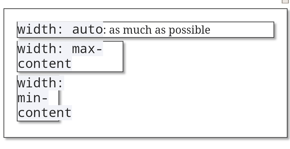
Before looking at fit-content
we have to briefly review two other special width
values: min-content
and max-content
. You need those in order to understand fit-content
.
Normally (i.e. with width: auto
defined or implied) a box will take as much horizontal space as it can. You can change the horizontal space by giving width
a specifc value, but you can also order the browser to determine it from the box’s contents. That’s what min-content
and max-content
do.
Try them below.
width: auto
: as much as possible
width: max-content
width: min-content
width: max-content
with a long text that runs the danger of disappearing right out of the browser window if it continues for much longer
min-content
means: the minimal width the box needs to contain its contents. In practice this means that browsers see which bit of content is widest and set the width of the box to that value. The widest bit of content is the longest word in a text, or the widest image or video or other asset.max-content
means: the width the box needs to contain all of its contents. In the case of text this means that all text is placed on one line and the box becomes as wide as necessary to contain that entire line. In general this is not a desirable effect. The largest bit of content may also be an image or video other asset; in that case browsers use this width to determine the box’s width.If you use hyphens: auto
or something similar, the browser will break the words at the correct hyphenation points before determining the minimal width. (I turned off hyphenation in the examples.)
All Chromium-based browsers on Android (tested in Chrome (v90), Samsung Internet (v87), and Edge (v77)) break off the 'width: max-content' text in the example above at the dash, and thus take the 'width: max-' as the max-content, provided the page does NOT have a meta viewport. No other browser does this — and that includes Chrome on Mac.
Also, Chromia on Android make the font-size a tad smaller when you resize the boxes below the maximum possible width. I will ignore both bugs because this article is about fit-content
, and not about these rabbit holes.
These bugs do NOT occur in UC (based on Chromium 78). Seems UC is taking its own decisions here, and is impervious to these particular bugs.
Now that we understand these values we also understand fit-content
. It is essentially a shorthand for the following:
box { width: auto; min-width: min-content; max-width: max-content; }
Thus the box sizes with its containing box, but to a minimum of min-content
and to a maximum of max-content
.
width: fit-content
: trying to find my fit
min-width: fit-content
max-width: fit-content
I’m not sure if this effect is useful outside a grid or flexbox context, but it’s here if you need it.
You can also use fit-content
as a min-width
or max-width
value; see the example above. The first means that the width of the box varies between min-content and auto, while the second means it varies between 0 and max-content.
I find this fairly useless and potentially confusing. What you really mean is min-width: min-content
or max-width: max-content
. If that’s what you mean, say so. Your CSS will be clearer if you do.
So I believe that it would be better not to use fit-content
for min-width
or max-width
; but only for width
.
Unfortunately, while fit-content
works in all other browsers, Firefox still needs a vendor prefix. So the final code becomes:
box { width: -moz-fit-content; width: fit-content; }
(These prefixes get harder and harder to defend as time goes by. fit-content
has perfectly fine cross-browser support, so I don’t see why Firefox doesn’t just go over to the regular variant.)
fit-content
does not work in flexbox and grid. In the example below the centre box has width: fit-content
; it does not work. If it worked the middle box would have a width of max-content
; i.e. as small as it needs to be to contain its text.
fit-content
The final example on this page has a test where you can see grid doesn’t understand this keyword, either.
Note that grid and flex items have min-width: min-content
by default, as you can see in the example above.
Let’s go to the more complex part: fit-content()
. Although it’s supposed to work for a normal width
, it doesn’t.
width: fit-content
: trying to find my fit
width: fit-content(200px)
You can use fit-content(value)
in grid templates, like:
1fr fit-content(200px) 1fr
fit-content(200px)
It means
1fr min(max-content-size, max(min-content, 200px)) 1fr
The max()
argument becomes min-content
or 200 pixels, whichever is larger. This is then compared to the maximum content size, which is the actual width available due to the constraints of the grid, but with a maximum of max-content
. So the real formula is more like this one, where available-size
is the available width in the grid:
1fr min(min(max-content,available-size), max(min-content, 200px)) 1fr
Some syntactic notes:
fit-content()
the function here. fit-content
the keyword does not work in grid definitions.-moz-
. Go figure.fit-content()
needs an argument; an empty function does not work. Also, an argument in fr
units is invalid.fit-content(stretch)
. It does not work anywhere, and isn’t referred to anywhere else. I assume it comes from an older version of the spec.I tested most of these things in the following example, where you can also try the bits of syntax that do not work — maybe they’ll start working later.
And that’s fit-content
and fit-content()
for you. It’s useful in some situations.
Below you can play around with fit-content()
in a grid.
Set grid-template-columns:
to
fit-content()
with some more text