If you want to make your websites ready form mobile, it’s best to combine <meta name="viewport" content="width=device-width"> with width media queries. That will give your site the optimal width (as determined by the device vendor, who really ought to know), and your site will look the better for it.
Lanyrd, Simon and Natalie’s latest brainchild, uses exactly this technique, and it establishes the perfect mobile browsing baseline. Try it on as many mobile browsers as you can, and you’ll see. No frills, just a simple user experience that just works.
In order to understand why we should use exactly this combination we should briefly repeat what meta viewports and media queries are all about.
This is a meta viewport tag:
<meta name="viewport" content="width=device-width">
It sets the browser’s layout viewport, relative to which CSS declarations such as width: 20% are calculated, to the device width.
(Incidentally, Opera has proposed to port this functionality to full CSS, which all in all seems to be a good idea. But for the moment we’re stuck with the HTML tag.)
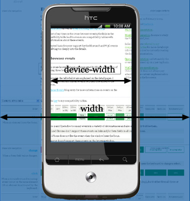
Normally the layout viewport takes a width that the vendor has decided is optimal for viewing desktop sites.
By setting the meta viewport to device-width you’re sure that your site’s width is optimised for the device it’s being viewed on.
The width media query compares the values you feed it to the layout viewport. Thus, if you do this:
body {
	// basic styles
}

@media all and (max-width: 600px) {
	body {
		// extra styles for mobile
	}
}

@media all and (min-width: 600px) {
	body {
		// extra styles for desktop
	}
}
the browser measures the layout viewport and applies the desktop styles if it is wider than 600 pixels, and the mobile styles if it’s smaller than that.
If you’d use these media queries without a meta viewport tag they would misfire horribly. Some mobile browsers, notably Safari iPhone, have a default layout viewport of around 850 to 1000 pixels — much larger than the device width. (Why? In order to accomodate desktop sites whose developers did not test on mobile. Such sites usually stretch to roughly that width.)
Thus the example code would conclude the browser is larger than 600 pixels, and apply the desktop styles instead of the mobile ones. Adding the meta viewport tag solves that problem
If you combine a width media query with the meta viewport tag, your site will use the width that the device vendor considers optimal. Although by itself that does not guarantee a perfect mobile experience, it will certainly help.
If you need JavaScript instead of CSS, query document.. This property contains the layout viewport width.
if (document.documentElement.clientWidth > 600) {
	// import complicated desktop scripts
}
In theory a device-width media query should do the same, even in the absence of a meta viewport tag. This media query measures the screen width instead of the layout viewport, and that’s what you’re interested in. Isn’t it?
Well, no, it’s not. There are two problems with using device-width instead of the combination of meta viewport and width media query.
First of all, there’s the problem I mentioned earlier: some browsers use a layout viewport that’s far wider than the screen width.
device-width correctly reads out the screen width, but once you adapt your layout to this width the page will have a huge right gutter that serves no purpose. After al, the layout viewport is far wider than the device width, and some browsers (notably Safari on the iPhone) will display the full layout viewport, including the useless whitespace on the right.
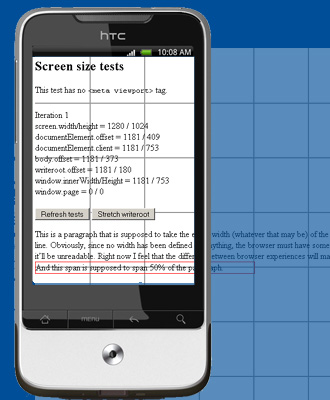
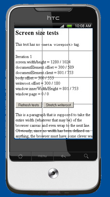
The second danger is that the formal screen width is not necessarily equal to the width a meta viewport tag yields. The best example is the Nexus One. The official screen width is 800 pixels, but when you apply <meta name="viewport" content="width=device-width"> it shrinks the layout viewport not to 800 pixels, but to 320 pixels (portrait) or 533 pixels (landscape).
Google did this because the size of the actual, physical pixels on the Nexus One is quite small. Generally that’s good because it gives most applications a crisper look. It’s bad for web development, though: if one such tiny device pixel would be the same as one CSS pixel, most websites would initially be far too small to read, even if the developer set the meta viewport tag.
That’s why Google decided to make the width according to width=device-width smaller than the actual, physical display width. If you add the meta viewport tag the Nexus One will use a layout viewport width of 320 pixels, and not of 800.
For us that means that a device-width media query without a meta viewport tag would misfire: it would adapt the site to an unreadable 800px instead of the Google-approved 320px.
Similarly, the iPhone 4’s Retina display has a far larger physical pixel density than previous iPhones, and its formal pixel density is 960. Still, it reports 320px for the device-width media query (as well as JavaScript screen.width) both with and without the meta viewport width=device-width.
Although it’s likely that other device vendors will follow Apple’s example and insert the width value they consider optimal into CSS and JavaScript, we can’t be sure of that. Besides, the current browsers do not display this behaviour.
Until now we’ve talked about using the device-width media query without the meta viewport tag. But what if we combine them?
Combining them is perfectly possible on the Nexus One: the device-width media query (and JavaScript screen.width) adapt to the new pseudo-device-width of 320px. The iPhone 4 always gives 320px anyway, so there’s no problem there, either.
Still, the question remains what the other browsers will do once they abandon their physical pixel count. I, for one, do not dare to gamble on that.
Besides, we’re not interested in the device width. We’re interested in the width of the layout viewport that the device vendor considers optimal. And that means combining a meta viewport tag with a width media query.
This is the blog of Peter-Paul Koch, web developer, consultant, and trainer.
You can also follow
him on Twitter or Mastodon.
Atom
RSS
If you like this blog, why not donate a little bit of money to help me pay my bills?
Categories:
Comments are closed.
1 Posted by Chris on 14 September 2010 | Permalink
How do the width media queries affect rendering on people who don't use a maximized browser window? The portion of the population that uses smaller browser windows probably has a significant overlap with those who will be confused when their favorite website looks strange because they suddenly get mobile styles.
2 Posted by ppk on 14 September 2010 | Permalink
Yes, if a user makes his window narrower than 600px he'll get the mobile styles in this example.
But I don't see why this would be bad. The site adapts to this user's specific circumstances.
3 Posted by kl on 14 September 2010 | Permalink
How about media query with physical size? min-width: 10cm?
4 Posted by Alan on 14 September 2010 | Permalink
kl, you'd still have the same problem because the "width" is the width is virtual rather than being determined by the physical dimensions.
You could avoid the problem altogether by using device-width in your queries (max-device-width and min-device-width are valid variables).
5 Posted by Jon B on 14 September 2010 | Permalink
If desktop min-width is 600px and mobile max-width is 600px, then surely if the device is actually 600px wide there would be a problem? Wouldn't it have trouble deciding on whether it was the max size of the mobile styles, or the min size of the desktop styles?
Shouldn't the min-width for desktop be 601px? I'm just confused...
6 Posted by ppk on 14 September 2010 | Permalink
About "physical" sizes: 1 inch is defined as 96 pixels, and all other physical sizes are calculated from there.
This is an absolute disaster for mobile; it would be very handy to be able to say
.nav a {min-height: 1cm}
to make sure that every link in the navigation takes at least one real-world centimeter. This could help immensely on touchscreen phones.
But it seems W3C has dropped the ball here and has messed up the definitions of the "physical" properties beyond recognition,
7 Posted by ppk on 14 September 2010 | Permalink
Regarding the 600px:
Yes, I think you're right and we should choose values that no sane device would ever use as either real or "logical" pixel count.
But we also have to decide where exactly the cut-off point between "desktop" and "mobile" is going to be, or if we need even more categories. 600px (meaning "around 600") is my latest proposal in this debate.
8 Posted by Kyle Barrow on 15 September 2010 | Permalink
Viewport and its use of density-independent pixels for high resolution screens is a poor stop gap for not fixing CSS "calculated" resolution and physical dimensions.
I'm looking forward to the day when I can use CSS to define a 1cm touch area with the knowledge that it will be touchable on any device, no matter the resolution or physical size.
9 Posted by David on 15 September 2010 | Permalink
The difference between physical pixels and CSS pixels is not Google nor Apple's invention.
They're actually following the spec :
http://www.w3.org/TR/css3-values/#relative0
"the user agent should rescale pixel values. It is recommended that the reference pixel be the visual angle of one pixel on a device with a pixel density of 96dpi and a distance from the reader of an arm's length. For a nominal arm's length of 28 inches, the visual angle is therefore about 0.0213 degrees."
Of course it makes a lot of sense, and is very useful.
10 Posted by Andreas Bovens on 15 September 2010 | Permalink
> The best example is the Nexus One. The official screen width is 800 pixels
Isn't the Nexus One's official screen width 480px (portrait) and 800px (landscape), which resp. translates to 320px and 533px?
Happy to see this article published, btw. It's an excellent guide to how meta viewport relates to media queries, which is something I've been talking about for a while - e.g. see http://my.opera.com/ODIN/blog/screencast-mobile-web-development-techniques
11 Posted by ppk on 15 September 2010 | Permalink
No, screen.width and device-width media query both give 800px in portrait mode, too.
12 Posted by Rob Manson on 15 September 2010 | Permalink
This is definitely an important combination...but designing for different devices is not simply about re-formatting for different screen sizes.
Different devices have different interaction models and different user contexts. All the people that keep saying content is king haven't realised that was a typo! Context is king! 8)
13 Posted by Andreas Bovens on 15 September 2010 | Permalink
@ppk Really? That doesn't make a lot of sense (or I'm confused).
14 Posted by ppk on 15 September 2010 | Permalink
They tried to cram in both their physical width and their CSS width. Maybe not the best idea in the world.
15 Posted by Chris on 15 September 2010 | Permalink
PPK, does that mean that using 600px in the media query will cause the Nexus One to use the desktop styles?
16 Posted by ppk on 18 September 2010 | Permalink
Yes, that would appear to be the case. Using the meta viewport tag solves the problem, though.
17 Posted by Chris on 19 September 2010 | Permalink
Ahh, thanks for clearing that up. Great article!
18 Posted by devlim on 20 September 2010 | Permalink
why i feel so confused and did not get what u trying to say.