Related files:
Many thanks to Grace Kloba (Google), David Storey and Anne van Kesteren (Opera), Mike O'Malley (Microsoft), Kartikaya Gupta and George Staikos (RIM), and Mark Finkle (Mozilla) for reviewing earlier versions of this piece and providing me with valuable feedback.
This article has been translated into Russian, Chinese, and Korean.
In this mini-series I will explain how viewports and the widths
of various important elements work, such as the <html> element, as well as the window and the screen.
On this page we’re going to talk about the mobile browsers. If you’re totally new to mobile I advise you to read part one about the desktop browsers first, in order to set the stage in a familiar environment.
When we compare the mobile browsers to the desktop ones, the most obvious difference is screen size. Mobile browsers display significantly less of a desktop-optimised website than desktop browsers; either by zooming out until the text is unreadably small, or by showing only the small part of the site that fits in the screen.
A mobile screen is far smaller than a desktop screen; think about 400px wide at maximum, and sometimes a lot less. (Some phones report larger widths, but they’re lying — or at the very least giving us useless information.)
An intermediate layer of tablet devices such as the iPad or the rumoured HP webOS-based one will bridge the gap between desktop and mobile, but that doesn’t change the fundamental problem. Sites must work on mobile devices, too, so we have to get them to display well on a small screen.
The most important problems center on CSS, especially the dimensions of the viewport. If we’d copy the desktop model one-to-one, our CSS would start to misfire horrendously.
Let’s go back to our sidebar with width: 10%. If mobile browsers
would do exactly the same as desktop browsers, they’d make the element about 40px wide at most, and that’s far too narrow. Your liquid layout would look horribly squashed.
One way of solving the problem is building a special website for mobile browsers. Even apart from the fundamental question of whether you should do that at all, the practical problem is that only very few site owners are sufficiently clued-in to cater specifically to mobile devices.
Mobile browser vendors want to offer their clients the best possible experience, which right now means “as much like desktop as possible.” Hence some sleight of hand was necessary.
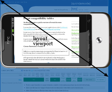
So the viewport is too narrow to serve as a basis for your CSS layout. The obvious solution is to make the viewport wider. That, however, requires it to be split into two: the visual viewport and the layout viewport.
George Cummins explains the basic concept best here at Stack Overflow:
Imagine the layout viewport as being a large image which does not change size or shape. Now image you have a smaller frame through which you look at the large image. The small frame is surrounded by opaque material which obscures your view of all but a portion of the large image. The portion of the large image that you can see through the frame is the visual viewport. You can back away from the large image while holding your frame (zoom out) to see the entire image at once, or you can move closer (zoom in) to see only a portion. You can also change the orientation of the frame, but the size and shape of the large image (layout viewport) never changes.
See also this explanation by Chris.
The visual viewport is the part of the page that’s currently shown on-screen. The user may scroll to change the part of the page he sees, or zoom to change the size of the visual viewport.
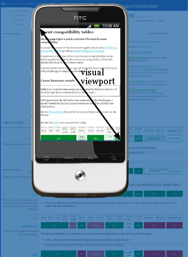
However, the CSS layout, especially percentual widths, are calculated relative to the layout viewport, which is considerably wider than the visual viewport.
Thus the <html> element takes the width of the layout viewport
initially, and your CSS is interpreted as if the screen were significantly wider than the phone screen. This makes sure that your site’s layout behaves as it does on a desktop browser.
How wide is the layout viewport? That differs per browser. Safari iPhone uses 980px, Opera 850px, Android WebKit 800px, and IE 974px.
Some browsers have special behaviour:
Both viewports are measured in CSS pixels, obviously. But while the visual viewport dimensions change with zooming (if you zoom in, less CSS pixels fit on the screen), the layout viewport dimensions remain the same. (If they didn’t your page would constantly reflow as percentual widths are recalculated.)
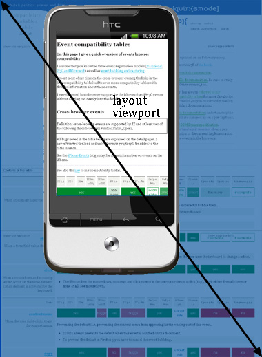
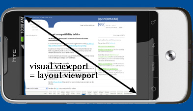
In order to understand the size of the layout viewport we have to take a look at what happens when the page is fully zoomed out. Many mobile browsers initially show any page in fully zoomed-out mode.
The point is: browsers have chosen their dimensions of the layout viewport such that it completely covers the screen in fully zoomed-out mode (and is thus equal to the visual viewport).
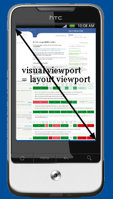
Thus the width and the height of the layout viewport are equal to whatever can be shown on the screen in the maximally zoomed-out mode. When the user zooms in these dimensions stay the same.
The layout viewport width is always the same. If you rotate your phone, the visual viewport changes, but the browser adapts to this new orientation by zooming in slightly so that the layout viewport is again as wide as the visual viewport.
This has consequences for the layout viewport’s height, which is now substantially less than in portrait mode. But web developers don’t care about the height, only about the width.
We now have two viewports that we want to measure. Therefore it’s very lucky that the Browser Wars gave us two property pairs.
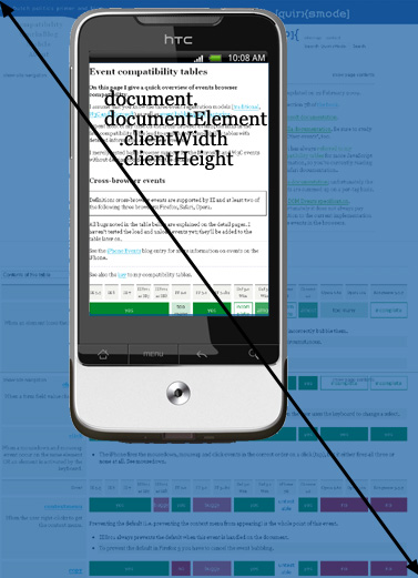
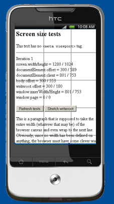
<meta viewport> tag is applied to the page; the dimensions of the <html> element otherwise.document.body.clientWidth/Height.
This is consistent with IE6 desktop.document.documentElement.clientWidth and -Height contain the
layout viewport’s dimensions.
The orientation matters for the height, but not for the width.
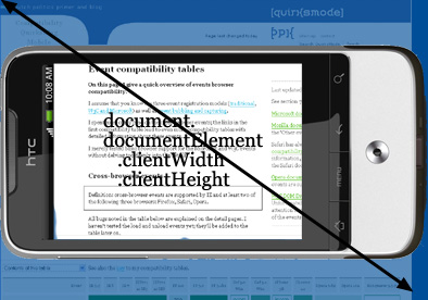
document.
documentElement. offsetWidth/Height.<html>, depending on whether a <meta viewport> tag has been applied to the page or not.As to the visual viewport, it is measured by window.innerWidth/Height. Obviously the measurements change when the user zooms out or in, since more or fewer CSS pixels fit into the screen.
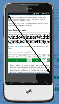
Unfortunately this is an area of incompatibilities; many browsers still have to add
support for the measurement of the visual viewport. Still, no browser stores this measurment in any other property pair, so I guess window.innerWidth/Height is a standard, albeit a badly supported one.
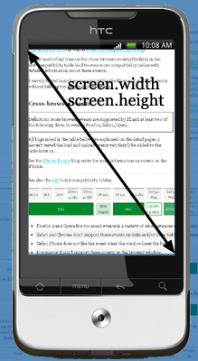
<html>, depending on whether a <meta viewport> tag has been applied to the page or not.As on desktop, screen.width/height give the screen size, in device pixels.
As on the desktop, you never need this information as a web developer. You’re not interested
in the physical size of the screen, but in how many CSS pixels currently fit on it.
Reading out the zoom level directly is not possible, but you can get it by dividing
screen.width by window.innerWidth. Of course that only works
if both properties are perfectly supported.
window.innerWidth — if it’s supported correctly.
<meta viewport> is applied to the page.
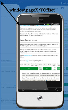
document. documentElement. scrollLeft / TopWhat you also need to know is the current position of the visual viewport relative to
the layout viewport. This is the scrolling offset, and, just as on desktop, it’s
stored in window.pageX/YOffset.
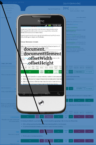
<html> element<html> element.document. body. clientWidth/Height for the correct values.Just as on desktop, document.documentElement.offsetWidth/Height gives
the total size of the <html> element in CSS pixels.
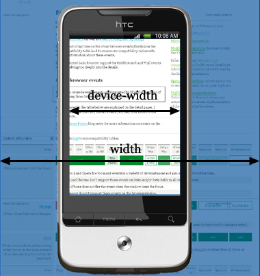
<html> element width (CSS pixels) or device width (device pixels).Media queries work the same as on desktop. width/height uses the layout viewport as its reference and is measured in CSS pixels, device-width/height uses the device screen and is measured in device pixels.
In other words, width/height mirrors the values of document. documentElement. clientWidth/Height, while device-width/height mirrors the values of screen.width/height. (They actually do so in all browsers, even if the mirrored values are incorrect.)
Now which measurement is more useful to us web developers? Point is, I don’t know.
I started out thinking that the device-width was the most important one, since it gives us some information about the device that we might be able to use. For instance, you could vary the width of your layout to accomodate the width of the device. However, you could also do that by using a <meta viewport>; it’s not absolutely necessary to use the device-width media query.
So is width the more important media query after all? Maybe; it gives some clue as to what the browser vendor thinks is a good width for a website on this device. But that’s rather vague, and the width media query doesn’t really give any other information.
So I’m undecided. For the moment I think that media queries are important to figure out whether you’re on a desktop, a tablet, or a mobile device, but not so very useful for distinguishing between the various tablet or mobile devices.
Or something.
Event coordinates work more or less as on desktop. Unfortunately, of the twelve tested browsers only two, Symbian WebKit and Iris, get all three exactly right. All other browsers have more or less serious problems.
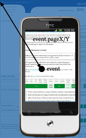
pageX/Y is still relative to the page in CSS pixels, and this is by far the most useful of the three property pairs, just as it is on desktop.
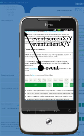
clientX/Y is relative to the visual viewport in CSS pixels. This makes sense, although I’m not entirely certain what it’s good for.
screenX/Y is relative to the screen in device pixels. Of course, this is the same reference that clientX/Y uses, and device pixels are useless. So we do not need to worry about screenX/Y; it’s every bit as useless as on desktop.
<meta viewport> is applied to the page in Samsung WebKit, several other properties change meaning.Finally, let’s discuss the <meta name="viewport" content="width=320">; originally an Apple extension but meanwhile copied by many more browsers.
It is meant to resize the layout viewport. In order to understand why that’s necessary, let’s take one step back.
Suppose you build a simple page and give your elements no width. Now they stretch up to take 100% of the width of the layout viewport. Most browsers zoom out to show the entire layout viewport on the screen, giving an effect like this:
All users will immediately zoom in, which works, but most browsers keep the width of the elements intact, which makes the text hard to read.
(The significant exception here is Android WebKit, which actually reduces the size of text-containing elements so that they fit on the screen. This is absolutely brilliant, and I feel all other browsers should copy this behaviour. I will document it fully later.)
Now what you could try is setting html {width: 320px}. Now the <html> element shrinks, and with it all other elements, which now take 100% of 320px. This works when the user zooms in, but not initially, when the user is confronted with a zoomed-out page that mostly contains nothing.
It is in order to get around this problem that Apple invented the meta viewport tag. When you set <meta name="viewport" content="width=320"> you set the width of the layout viewport to 320px. Now the initial state of the page is also correct.
You can set the layout viewport’s width to any dimension you want, including device-width. That last one takes screen.width (in device pixels) as its reference and resizes the layout viewport accordingly.
There’s a catch here, though. Sometimes the formal screen.width does not make much sense because the pixel count is just too high. For instance, the Nexus One has a formal width of 480px, but Google engineers have decided that giving the layout viewport a width of 480px when using device-width is just too much. They shrank it to 2/3rds, so that device-width gives you a width of 320px, just as on the iPhone.
If, as is rumoured, the new iPhone will sport a larger pixel count (which does not necessarily equal a larger screen!), I wouldn’t be surprised if Apple copies this behaviour. Maybe in the end device-width will just mean 320px.
Several related topics have to be researched further:
position: fixed. A fixed element, as we know, is positioned relative to the viewport. But relative to which viewport?width: 1500px into one of my test pages? The element will stick out of the HTML element (overflow: visible), but that means that the actual viewport can become wider than the layout viewport. Besides, an old Android (Nexus One) enlarged the HTML element when this happens. Is that a good idea?