In this mini-series I will explain how viewports and the widths
of various important elements work, such as the <html> element, as well
as the window and the screen.
This page is about the desktop browsers, and its sole purpose is to set the stage for a similar discussion of the mobile browsers. Most web developers will already intuitively understand most desktop concepts. On mobile we’ll find the same concepts, but more complicated, and a prior discussion on terms everybody already knows will greatly help your understanding of the mobile browsers.
The first concept you need to understand is CSS pixels, and the difference with device pixels.
Device pixels are the kind of pixels we intuitively assume to be “right.”
These pixels give the formal resolution of whichever device you’re
working on, and can (in general) be read out from screen.width/height.
If you give a certain element a width: 128px, and your monitor
is 1024px wide, and you maximise your browser screen, the element would fit on your
monitor eight times (roughly; let’s ignore the tricky bits for now).
If the user zooms, however, this calculation is going to change. If the user zooms to 200%, your
element with width: 128px will fit only four times on his 1024px wide monitor.
Zooming as implemented in modern browsers consists of nothing more than “stretching up” pixels. That is, the width of the element is not changed from 128 to 256 pixels; instead the actual pixels are doubled in size. Formally, the element still has a width of 128 CSS pixels, even though it happens to take the space of 256 device pixels.
In other words, zooming to 200% makes one CSS pixel grow to four times the size of one device pixels. (Two times the width, two times the height, yields four times in total).
A few images will clarify the concept. Here are four pixels on 100% zoom level. Nothing much to see here; CSS pixels fully overlap with device pixels.
Now let’s zoom out. The CSS pixels start to shrink, meaning that one device pixel now overlaps several CSS pixels.
If you zoom in, the opposite happens. The CSS pixels start to grow, and now one CSS pixels overlaps several device pixels.
The point here is that you are only interested in CSS pixels. It’s those pixels that dictate how your style sheet is rendered.
Device pixels are almost entirely useless to you. Not to the user; the user will zoom the page in or out until he can comfortably read it. However, that zooming level doesn’t matter to you. The browser will automatically make sure that your CSS layout is stretched up or squeezed in.
I started the example by assuming a zoom level of 100%. It’s time to define that slightly more strictly:
At zoom level 100% one CSS pixel is exactly equal to one device pixel.
The concept of 100% zoom is very useful in the explanations that are going to follow, but you shouldn’t overly worry about it in your daily work. On desktop you will generally test your sites in 100% zoom, but even if the user zooms in or out the magic of CSS pixels will make sure that your layout retains the same ratios.
Let’s take a look at some practical measurements. We’ll start with
screen.width and screen.height.
They contain the total width and height of the user’s screen. These dimensions are
measured in device pixels because they never change: they’re a feature of the monitor,
and not of the browser.
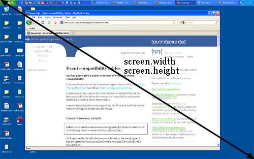
Fun! But what do we do with this information?
Basically, nothing. The user’s monitor size is unimportant to us — well, unless you want to measure it for use in a web statistics database.
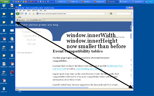
Instead, what you want to know is the inner dimensions of the browser window.
That tells you exactly how much space the user currently has available for your CSS layout.
You can find these dimensions in window.innerWidth and window.innerHeight.
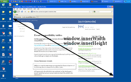
Obviously, the inner width of the window is measured in CSS pixels. You need to know how much
of your layout you can squeeze into the browser window, and that amount decreases as the user
zooms in. So if the user zooms in you get less available space in the window, and
window.innerWidth/Height reflect that by decreasing.
(The exception here is Opera, where window.innerWidth/Height
do not decrease when the user zooms in: they’re measured in device pixels. This is annoying
on desktop, but fatal on mobile, as we’ll see later.)
Note that the measured widths and heights include the scrollbars. They, too, are considered part of the inner window. (This is mostly for historical reasons.)
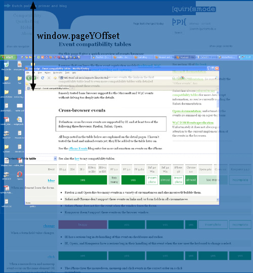
window.pageXOffset and window.pageYOffset,
contain the horizontal and vertical scrolling offsets of the document. Thus you can find out how
much the user has scrolled.
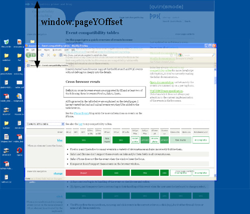
These properties are measured in CSS pixels, too. You want to know how much of the document has already been scrolled up, whatever zoom state it’s in.
In theory, if the user scrolls up and then zooms in, window.pageX/YOffset will
change. However, the browsers try to keep web pages consistent by keeping the same element at
the top of the visible page when the user zooms. That doesn’t always work perfectly, but
it means that in practice window.pageX/YOffset doesn’t really change: the number
of CSS pixels that have been scrolled out of the window remains (roughly) the same.
Before we continue with more JavaScript properties we have to introduce another concept: the viewport.
The function of the viewport is to constrain the <html> element, which is the
uppermost containing block of your site.
That may sound a bit vague, so here’s a practical example. Suppose you have a liquid
layout and one of your sidebars has width: 10%. Now the sidebar neatly grows and shrinks
as you resize the browser window. But exactly how does that work?
Technically, what happens is that the sidebar gets 10% of the width of its parent. Let’s
say that’s the <body> (and that you haven’t given it a
width). So the question becomes which width the <body> has.
Normally, all block-level elements take 100% of the width of their parent (there are exceptions,
but let’s ignore them for now). So the <body>
is as wide as its parent, the <html> element.
And how wide is the <html> element? Why, it’s as wide as the browser window.
That’s why your sidebar with width: 10% will span 10% of the entire browser window.
All web developers intuitively know and use this fact.
What you may not know is how this works in theory. In theory, the width of the <html>
element is restricted by the width of the viewport. The <html> element takes
100% of the width of that viewport.
The viewport, in turn, is exactly equal to the browser window: it’s been defined as such. The viewport is not an HTML construct, so you cannot influence it by CSS. It just has the width and height of the browser window — on desktop. On mobile it’s quite a bit more complicated.
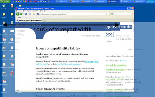
This state of affairs has some curious consequences. You can see one of them right here on this site. Scroll all the way up to the top, and zoom in two or three steps so that the content of this site spills out of the browser window.
Now scroll to the right, and you’ll see that the blue bar at the top of the site doesn’t line up properly any more.

This behaviour is a consequence of how the viewport is defined. I gave the blue bar at the top
a width: 100%. 100% of what? Of the <html> element, which is as wide
as the viewport, which is as wide as the browser window.
Point is: while this works fine at 100% zoom, now that we’ve zoomed in the viewport has
become smaller than the total width of my site. In itself that doesn’t matter, the content
now spills out of the <html> element, but that element has
overflow: visible, which means that the spilled-out
content will be shown in any case.
But the blue bar doesn’t spill out. I gave it a width: 100%, after all, and
the browsers obey by giving it the width of the viewport. They don’t care that that width
is now too narrow.
What I really need to know is how wide the total content of the page is, including the bits that “stick out.” As far as I know it’s not possible to find that value (well, unless you calculate the individual widths and margins of all elements on the page, but that’s error-prone, to put it mildly).
I am starting to believe that we need a JavaScript property pair that gives what I’ll call the “document width” (in CSS pixels, obviously).
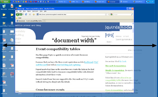
And if we’re really feeling funky, why not also expose this value to CSS? I’d
love to be able to make the width: 100% of my blue bar dependent on the
document width, and not the <html> element’s width. (This is bound to
be tricky, though, and I wouldn’t be surprised if it’s impossible to implement.)
Browser vendors, what do you think?
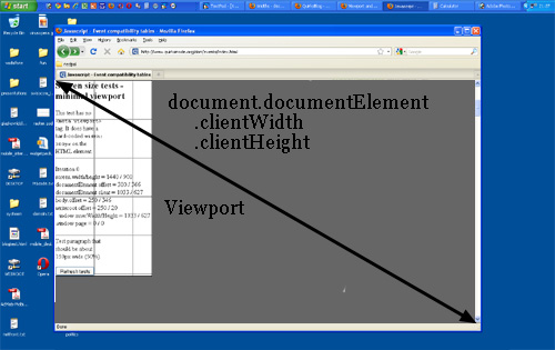
You might want to know the dimensions of the viewport.
They can be found in document.documentElement.clientWidth
and -Height.
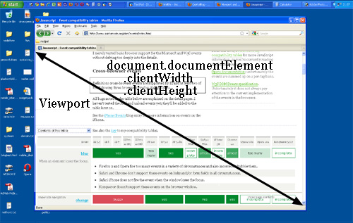
If you know your DOM, you know that document.documentElement is in fact the
<html> element: the root element of any HTML document. However, the viewport is
one level higher, so to speak; it’s the element that contains the <html>
element. That might matter if you give the <html> element a width.
(I don’t recommend that, by the way, but it’s possible.)
In that situation document.documentElement.clientWidth
and -Height still gives the dimensions of the viewport, and not of the <html>
element. (This is a special rule that goes only for this element only for this property
pair. In all other cases the actual width of the element is used.)
So document.documentElement.clientWidth and -Height always gives
the viewport dimensions, regardless of the dimensions of the <html> element.
But aren’t the dimensions of the viewport width also given by window.innerWidth/Height?
Well, yes and no.
There’s a formal difference between the two property pairs: document.documentElement.clientWidth
and -Height doesn’t include the scrollbar, while window.innerWidth/Height
does. That’s mostly a nitpick, though.
The fact that we have two property pairs is a holdover from the Browser Wars.
Back then Netscape only supported
window.innerWidth/Height and IE only document.documentElement.clientWidth
and -Height. Since then all other browsers started to support clientWidth/Height,
but IE didn’t pick up window.innerWidth/Height.
Having two property pairs available is a minor nuisance on desktop — but it turns out to be a blessing on mobile, as we’ll see.
<html> element<html> element (and thus of the page).<html>
element.So clientWidth/Height gives the viewport dimensions in all cases. But where can we find
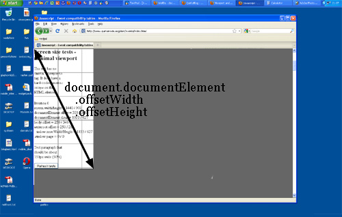
the dimensions of the <html> element itself? They’re stored in
document.documentElement.offsetWidth and -Height.
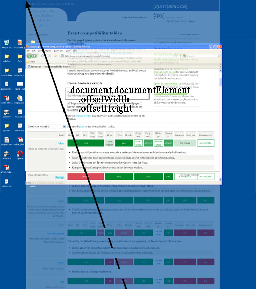
These properties truly give you access to the <html> element as a block-level
element; if you set a width, offsetWidth will reflect it.
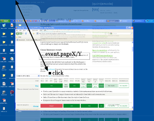
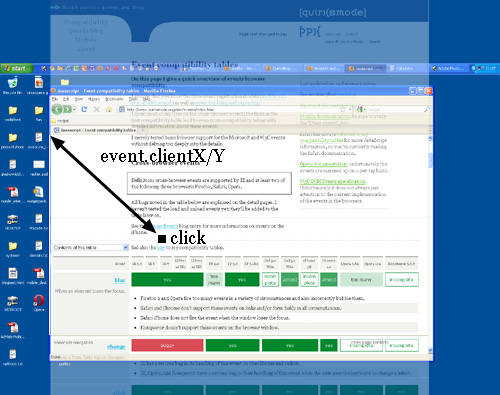
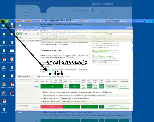
Then there are the event coordinates. When a mouse event occurs, no less than five property pairs are exposed to give you information about the exact place of the event. For our discussion three of them are important:
pageX/Y gives the coordinates relative to the <html>
element in CSS pixels.clientX/Y gives the coordinates relative to the viewport in CSS pixels.screenX/Y gives the coordinates relative to the screen in device pixels.You’ll use pageX/Y 90% of the time; usually you want to know the
event position relative to the document. The other 10% of the time you’ll use
clientX/Y. You never ever need to know the event coordinates relative to
the screen.
device-width/height Firefox uses the values screen.width/height
would have if they are measured in CSS pixels.width/height Safari and Chrome use the values documentElement .clientWidth/Height
would have if they are measured in device pixels.Finally, some words about media queries. The idea is very simple: you can define special CSS rules that are executed only if the width of the page is larger than, equal to, or smaller than a certain size. For instance:
div.sidebar {
	width: 300px;
}

@media all and (max-width: 400px) {
	// styles assigned when width is smaller than 400px;
	div.sidebar {
		width: 100px;
	}

}
Now the sidebar is 300px wide, except when the width is smaller than 400px, in which case the sidebar becomes 100px wide.
The question is of course: which width are we measuring here?
There are two relevant media queries: width/height and device-width/device-height.
width/height uses the same values as
documentElement .clientWidth/Height (the viewport, in other words). It works
with CSS pixels.device-width/device-height uses the same values as screen.width/height
(the screen, in other words). It works with device pixels.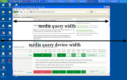
Which should you use? That’s a no-brainer: width, of course.
Web developers are not interested in the device width; it’s the width of the browser
window that counts.
So use width and forget device-width — on desktop. As we’ll
see, the situation is much more messy on mobile.
That concludes our foray into the desktop browsers’ behaviour. The second part of this series ports these concepts to mobile and highlights some important differences with the desktop.