Just now I published the retests of the CSS Images and replaced content spec, which includes gradients. It was during these tests yesterday that I discovered Android screenshots aren’t always trustworthy, and meanwhile I’ve got enough information for an update.
Many people advised me to take a screenshot of the screenshot. I did, and it shows the original screenshot correctly instead of repeating the problem. So this avenue of research does not lead anywhere.
The vast majority of commenters agrees that the screenshot problem is caused by incorrect calibration of the device screen; that is, the correct gradient RGBA colour values the browser passes on to the OS cannot be processed correctly, and as a result the colours as shown on the screen are incorrect. However, the screenshot app gets its data directly from the browser, and thus shows the correct colours.
The most often-repeated advice I got was to take a screenshot of the published screenshot and see what happens. Apparently the expectation was that this meta-screenshot would have the same problems as the original gradient. That turns out not to be the case.
Here is my first ever meta-screenshot, taken with the Sony Xperia S of yesterday’s screenshots. For comparison I also repeat the original screenshot.
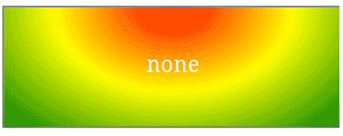
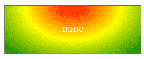
I don’t see a lot of difference in the gradient, and the conclusion must be that the Xperia handles the image correctly, and does not repeat the original calibration problems here. So this research angle leads nowhere.
The final question is which devices are actually incorrectly calibrated. I went through all of my devices that have a browser capable of showing gradients, sent them to the test page, and the results are in the table below:
| Calibrated | Not calibrated |
|---|---|
|
Apple iPad 2 Apple iPhone 4S BlackBerry Z10 Google Nexus 4 Google Nexus 7 HTC M8 HTC One X Huawei C8813 Microsoft Surface Motorola Moto G Nintendo Wii U Nokia Lumia 520 Nokia Lumia 820 Samsung Galaxy Note I Samsung Galaxy S4 Wolfgang AT-AS45FW Xiaomi M2 |
LG L5 Sony Xperia S T2Mobile Flame |
It turns out that most devices actually properly calibrate their screens; the only exceptions being the LG L5, Xperia S, and the Flame (the Firefox OS reference device). So this problem may not be as huge as I initially thought.
The rest of the tests was fairly uneventful. It turns out that all desktop browsers now support the new syntax, and Safari iOS and Chrome Android do as well. The other WebKit-based browsers still require middle syntax. Interesting, but expected.
Also, it turns out that IE has a bug when you define linear gradients with angle keywords in a non-square box. The IE team has meanwhile confirmed the bug and is working on an update. Compare this page in IE and any other browser, and pay close attention to the red. A corner of each element should show full red, but in IE that doesn’t happen. Below you see screenshots; IE left, Chrome right.


Finally, Firefox now supports image-orientation. The other browsers don’t.
Anyway, this was an eventful retest. I hope my next one is nice and boring.
This is the blog of Peter-Paul Koch, web developer, consultant, and trainer.
You can also follow
him on Twitter or Mastodon.
Atom
RSS
If you like this blog, why not donate a little bit of money to help me pay my bills?
Categories: