B. is an old friend of mine who owns an old Nokia. And when I say old, I mean really old. It was released somewhere in 2000 or so (the Nokia, not the friendship). It’s not a smartphone, to put it mildly, and B. does not use the mobile Web.
Yet.
Pretty soon, however, B. is going to spend a few months in the outlying parts of Indonesia, and during that time he has to be able to access his business bank account. He was wondering if a modern mobile phone would fit this use case, and, if so, which one.
When he told me all that I whipped out my iPhone. “Something like this, you mean?” He was suitably impressed, and when I told him I regularly have six to twelve phones lying around on my desk he practically begged for an opportunity to come by and try them all in order decide what kind of phone he wants.
That was of course fine by me. User testing is never to be despised, and since B. is not technical and has no experience with touchscreens to speak of, he is the perfect test subject.
Last week we held our session, and this entry is the report.
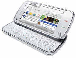
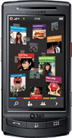
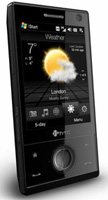
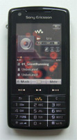
Tested phones: Nokia N97, Samsung M1, HTC Touch Pro (Windows Mobile), SonyEricsson W960i, Nokia E71, BlackBerry 9500, HTC Pioneer (Android), LG M900, Nokia N900, iPhone.
B. is not technically inclined, to put it mildly. His knowledge of the Web is best summarised by this short discussion that ensued when I gave him the HTC Windows Mobile phone:
On the other hand, B. has an excellent idea of what he needs. He needs access to his bank account and he has to be able to take common actions.
B. knows his workflow: go to Google, search for the entry page to his banking site, go there, log in, and do stuff. I warned him he’d better skip the first step in Indonesia. The network is bound to be slow, and skipping one page load is definitely a good idea. I also revealed the existence of bookmarks.
B.’s target is Mijn ING, which is definitely not the most advanced Dutch banking site. Most of the problems we encountered were in the later, password-protected pages, so you can’t view them in your browser unless you also bank with ING. (I do, so I might take a shot at researching a few problems.)
We tested ten phones, and in all cases I made sure the phone had a connection and was on the home screen. After that I handed it over.
The original plan was not to offer B. any further help, but pretty soon it turned out I had to teach him how to zoom. Not only was he completely unacquainted with any kind of zooming, but the eight phones that have zooming capability use five different mechanisms (double-tap, pinch, Android, BlackBerry, and Maemo), and leaving B. to discover them by himself would have taken far too much time.
I also explained other interface elements I thought might help him. I’m not sure if this is good methodology, but it cut down testing time considerably.
As to the actual phones we tested, that was mostly a matter of coincidence. I’d taken a lot of touchscreens with me from Düsseldorf because I’m doing some complicated touch research for Vodafone. In addition, all four phones I received as a gift from interested parties are touchscreens, too.
I’d have loved to include the Palm Pre in this test, but at the time of writing I have not yet figured out how to skip the sign-up screen on my locked British one.
I also left out the Samsung F700 because I exclusively use it to torture UX experts. That brought the total number of phones down to ten.
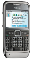
Nine out of these ten were touchscreens (with the Nokia E71 as the exception). In retrospect it would have been better if we’d had one or two more non-touchscreens to test.
I decided on the testing order in advance. On the one hand I wanted to bunch up the phones I thought good toward the end of the session, because I wanted to see if they’re really that much better than all the others in the opinion of an outsider without any experience.
On the other hand I didn’t want to start with the very worst phones because that would only depress B. So I started with the most medium phone I could think of, the N97.
As a practical matter, I had to alternate wifi-capable phones with SIM-only phones in order to have time to insert the SIM card and start up the next SIM-only phone while B. was working with a wifi-capable phone. The BlackBerry, especially, needs a lot of startup time.
Finally, I decided to use the default browser on every phone. I do not believe that many non-technical users will download another browser when their phone contains one that appears to be working. Besides, I’d have to explain the “other browsers” concept to B., and I decided that that would take too much time.
I handed B. the phones in the order they’re treated below and recorded his impressions.
Starting up an S60 WebKit when you want to use a wifi connection is a total disaster, so I did that for B., but otherwise I left him to his own devices.
Since this was the very first phone in the test, neither B. nor I had any expectations. I was mainly curious to see how he worked with the phone. In general this first encounter went rather well, especially once B. discovered the four-way navigation pad on the left.
In fact, B. took only a few minutes to figure out the single most serious problem with touchscreen interfaces. He ran into trouble when he wanted to click on something but the browser scrolled instead, or vice versa. He thought it was just him being dumb, but I could disabuse him of that notion.
The touch event is way overloaded. Touching the screen may start a click, a scroll, or a zoom action, and the less able a browser is to distinguish between these actions, the lousier the interface appears to be. Handling these distinctions well is what separates the iPhone from all other phones.
Because the links on the banking site are pretty bunched up B. had to use his nail to click on links. The discovery of the stylus two phones later helped measurably here. I forgot to explain zooming to him in this case, but the S60 WebKit zoom is lousy, anyway.
It turns out that the S60 WebKit sometimes crashes on one particular banking page. I was not able to quickly figure out whether it was a problem with the browser or a problem with the site.
I handed B. this phone in natural state, and not with the home screen activated. He figured out the slider by himself, but then he saw the Vodafone 360 screen (see screenshot), and his first reaction was “what a confusing interface.” Vodafone 360 can indeed be daunting if you hardly know what a social network is. B. is clearly not part of the M1’s target audience.
On this phone B. encountered his first software keyboard, and he gave it cautiously positive rating: it didn’t work as badly as he’d feared. Still, later on he revised this opinion. Especially in portrait mode the keyboard and the individual keys were too narrow.
This phone uses Opera, and this particular Opera has been extended with several interface features: Opera Fingertouch, as well as a zoomer that works by sliding a block from top (zoom out) to bottom (zoom in). This block becomes visible on double-tap.
B. used Fingertouch intuitively and without commenting on it. Not using it is not an option: if Opera doesn’t understand which link you want to click, it fires up Fingertouch. So B. had to use it, and that turned out not to be a problem.
As to the zoom, it didn’t really work for B. That is not entirely Opera’s fault; one of the M1’s problems is that the touchscreen may sometimes be a bit unresponsive when you double-tap or drag the zoom block.
All in all this phone was not a success.
It was when I handed him this phone that B. and I had the short conversation I quoted at the start of this article. He started up IE and surfed to his banking account without many problems. I had to point out where IE hides its menu, but then he started using IE’s sliding zoom, which is similar to Opera’s, except that this phone’s way more responsive.
B. absolutely loved the stylus that comes with this phone, and went back to the M1 and N97 to test whether it also worked there. He kept trying it with all other phones, too, and decided to get one no matter what kind of phone he would eventually buy.
He was also glad he could once again work with a hardware keyboard. So glad, in fact, that he started using the arrow keys on the hardware keyboard in order to scroll the page, just as you would on a desktop computer.
My notes say that these keys don’t work, but when I retested it they worked as expected. However, there’s a perceptible pause in IE before the scrolling starts. Maybe that’s what threw us off track.
My particular Touch Diamond has one extremely annoying bug: when you press the “1” on the hardware keyboard, the phone goes back to the home screen. This is especially funny when your banking user name contains a “1.” Fortunately I knew we could use the software keyboard to type the offending character; it’s unlikely B. would have figured that out by himself.
As far as I’m concerned the idiot who thought up this “feature” should be taken behind a shed and shot. I asked B. not to consider it when judging the phone.
This phone is by far the oldest we tested, and it’s easy to see that age does make a difference in the mobile space. Not that it doesn’t work, but everything is a bit cranky, and both the OS and the browser (Opera 8.65) are older ones.
This is also the single tested phone with a numerical keyboard. That was no problem; B. has been using them exclusively for years and is way faster with them than I am. He commented favourably on the small menu top-right that shows all characters that reside under a certain key.
On this phone I showed him Opera’s mobile view, in which the entire site is displayed in a narrow column that fits the screen. B. clearly liked it. Unfortunately the site didn’t: the actual data never showed up in the mobile view.
Still B. did not like this phone. Too clunky and kludgy. The only thing I regret is that I plain forgot to point out the scroll wheel on the side.
Now we come to the single phone B. already knew because his girlfriend owns it. As a result B. is less likely to buy it, although he readily admitted this had nothing to do with its technical specs.
Again I opened the browser for him due to Symbian’s serious mishandling of the connection between wifi and browser.
Now B. had to type in the URL to start. He touched the screen repeatedly, and I had to remind him that this is the single non-touchscreen phone in the entire test. He asked me how to enter a URL, and I had to take over the phone and use it in order to remember that you just have to start typing and the browser relegates your keypresses to the location bar.
B. absolutely loved the four-way navigation and S60’s pseudo-cursor. It made the interface much clearer to him, and he couldn’t possibly go wrong when selecting a link to click.
When we came to the actual target page, though, it turned out not to work. After the normal header the page said “fastinnerhtml” and then nothing.
Now in itself this is a true statement — I proved as much back when nobody had ever heard of performance testing. Still, it’s an odd message to show on your site. I haven’t yet decided whether the site’s programmer is a total idiot or has a wonderful sense of humor.
If the site had actually worked the E71 would have scored very well in B.’s opinion.
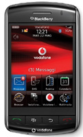
Back to touchscreens. The BlackBerry came next, and pretty soon B. ran into severe interface problems when trying to click on options in the browser menu.
Now in theory the BlackBerry interface is pretty good. You have to actually depress the screen in order to activate something, but as soon as your finger touches an option it lights up in blue.
The problem is that your finger will probably move a few pixels between touching the screen and clicking on it, and it happens too often that the correct option will highlight, but you’ll click on the wrong one because of this finger sliding. This is a generic BlackBerry problem that holds back an otherwise well thought-out system.
Then, as I knew he would, B. accidentally pressed the hardware button on the left side of the phone. The screen went white, and after a few seconds a woman’s voice said “Sagen Sie einen Befehl!” (It’s a German BlackBerry.) I taught B. the proper response (“Halts Maul”) and warned him not to press the button again.
Login was succesful, but then the site sent the BlackBerry browser a lot of JavaScript, and that’s something this browser can’t handle. It just gave up after a while, as it’s wont to do, and the site did not work.
Good thing BlackBerry is going to use a WebKit-based browser in the future.
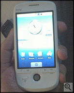
Then we came to the Android, and I had high hopes of this phone. Until now B. had only used touchscreen phones that I knew were flawed in some way or another. I was curious how he’d react to a good one. He did not disappoint. His first remark was: “Oh, this is a lot better than the previous ones!”
Still, the more B. used it the less enthousiastic he became. He deplored the lack of a hardware keyboard and again complained that it was so hard to select a link to click. When I pointed out the trackball he got the idea immediately but thought it was far too sensitive. He had to try very hard to use it right. I searched for a trackball setting, but there doesn’t seem to be any.
Filling out the login form turned out to be very hard, especially because B. held the phone in landscape orientation. In that case, one form field and the software keyboard combine to fill the entire screen, and it’s not at all clear how to proceed to the next field.
It turned out we had to press the Enter key to exit a text input. Later on I tried a textarea in landscape mode, and pressing the Enter key (correctly) added a line break, but didn’t exit the textarea. It turns out you have to rotate the phone back to portrait mode. Not ideal.
B. was imperfectly satisfied with this Android. It had given him an idea of how a proper touchscreen should work, but had let him down when it came to the details, even though he reached the banking site and could do what he wanted to do.
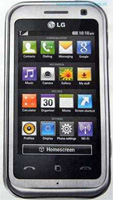
When testing the LG phone B. was very happy with the slight vibration that accompanies every single keypress, but less so with the total lack of feedback that clicking on a link yields. Did I press the right one? Is something happening? The LG/Obigo interface doesn’t give a clue.
Still, we made progress. Until Google pulled its evil trick.
As usual, B. went to Google first in order to search for the entry link to his site. It turns out that Google in its infinite wisdom sends this Obigo browser through GWT hell, which causes the banking site to be completely unusable.
I considered delving deeper into this problem, but first asked B. if he thought this phone was a serious contender. When he said No we decided to move on to the next one.
Still, the fact that Google messes with web content is unacceptable. And GWT is an pestilence that should be eradicated from the world. Expect to hear more of this.
Late update: Four days after publishing this article I found out that this phone does support wifi.
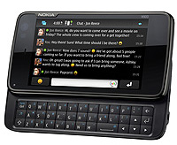
Then came the Nokia N900, the first Maemo Linux-based phone, which I have high hopes of. I had to show B. the hardware zoom button at the top of the device, but once he got that the phone worked well.
So well, in fact, that while I put away the LG phone, poured some more drinks, and made a few notes, B. had already found, opened and used his banking site.
This was the first phone that he didn’t need help with at all, even for a minor issue. It just worked. And that’s rare.
B. commented again that it’s so hard on some phones to distinguish click actions from scroll actions from zoom actions, but that the hardware zoom button solved most of that problem.
When B. discovered that the HTC Touch Diamond’s pen also works with the Maemo, he became even more happy.
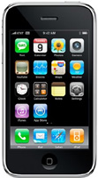
Finally, the iPhone. I’d deliberately saved it for last, and was not disappointed. I only had to tell him the browser is called Safari, and off he was, logging in and working with his banking site. “Oh,” B. said, “so this is how a touchscreen is supposed to work.”
Finding and using the site took as little time as it had on the Maemo, and after B. was done he again tried a click, a scroll, and a zoom action, and commented that this phone did understand what he was trying to do instead of mostly guessing wrong.
He concluded that he understood the iPhone hype fully now; all the praise was well deserved.
Finally I asked B. to rank the ten phones from good to bad. This ranking mostly confirmed the picture I had formed of the phone market, except that the iPhone and especially the Android ended up lower on the list than I expected.
B.’s most severe problem was the lack of distinction some phones make between a click, zoom, and scroll action, and this fits seamlessly into the larger picture of the market as a whole. Of the pure touchscreen devices, only the iPhone has truly solved this problem. The others are in various stages of catching up with Apple.
B. also had trouble with clicking on the right links because they’re too bunched up in his banking site. The most obvious solution to that problem is zooming, and therefore his top two consisted of the phones that allow for graceful, easy zooming.
More in general, B. is a hardware man. He consistently put the phones with better hardware controls higher on his list, with the iPhone and the E71 as the only exceptions. He has also decided to buy a stylus no matter which phone he’ll eventually get.
In the end, after much deliberation, B. put the Nokia N900 in the top slot above the iPhone.
He was extremely careful to note that he did so only because he felt that the hardware keyboard and zoom button were most conductive to his personal goal of accessing and working with his online banking site. He could imagine that the iPhone would be better suited for other purposes.
This confirms my hunch that Nokia is on the right track with the Maemo platform. The next Maemo phone, I think, will be something to watch.
To my surprise he ranked Windows Mobile above Android. Although he liked Android, it did not entirely deliver on its promises as far as B. was concerned. Windows Mobile promised less, but delivered.
Curiously, the six best phones in his opinion were also the wifi-capable phones, while the four SIM-only phones made up the bottom of the list. Apparently support for wifi is a measure of phone quality.
All in all this was a very useful session, both for B. and for me. Maybe I’ll repeat this later on, with another friend (and probably a slightly different line-up of phones).
Update: A week after this article appeared, B. told me he’d bought a Nokia N72. His reasoning was that no touchscreen save for the iPhone was good enough, and het got the N72 for free (with subscription, obviously). So no touchscreen for B.
Later update: It turns out B. bought an E72, not an N72. I installed Opera Mini on it just to be on the safe side.
This is the blog of Peter-Paul Koch, web developer, consultant, and trainer.
You can also follow
him on Twitter or Mastodon.
Atom
RSS
If you like this blog, why not donate a little bit of money to help me pay my bills?
Categories:
Comments are closed.
1 Posted by qFox on 6 January 2010 | Permalink
Very nicely put down. This is what vendors should do more often; pick somebody from the street and test their products with people who haven't got a clue...
2 Posted by Daniel on 6 January 2010 | Permalink
It's really quite cool to read a review like this, documenting what happens when you put Jack User in front of this armada of "smart"-phones is a great idea. Shocking you showed him a UIQ though (W960i), I'm glad you both survived.
Also I'm not sure why you think the “press '1.'" Windows Mobile bug should not be considered when judging the phone, this is just what happens in anyone tries to use it.
What this review doesn't show is how good or bad you can get used to a system, that also shows how consistent it works. Having used all of the above phones, I think this would mean a better ranking for S60, Android and iPhone.
Great study! Sagen Sie einen Befehl!
3 Posted by Jason on 6 January 2010 | Permalink
"Still, the fact that Google messes with web content is unacceptable."
You should speak to your employer about this some time. ;-)
4 Posted by Emile on 6 January 2010 | Permalink
And what would have happened if you gave him the iPhone at first? He gained a lot of experience because of the other phones, ofcourse.
5 Posted by Janusz on 6 January 2010 | Permalink
Great review. Would be interesting to see how Google Nexus stands against the others and especialy HTC Android.
6 Posted by boriscallens on 6 January 2010 | Permalink
Great review.
Would love to see more of this. Really wondering what people would say about the HTC Hero
7 Posted by Ryan McGrath on 6 January 2010 | Permalink
What version of Android was he testing on, though? I (and this might just be me) feel like anything pre-2.0 is nowhere near a contender to, say, the iPhone.
8 Posted by Nicolas Chevallier on 6 January 2010 | Permalink
Thanks for sharing this usability test. Personaly I have tested a lot of phones, and the best is absolutely iPhone. It's one of the reasons iPhone is a commercial success : safari detects and reacts as we want, even if sometimes it's a bit slow to reflow the webpage.
9 Posted by Ivan Bretan on 6 January 2010 | Permalink
Brilliant reality check which brings to the fore the mindboggling fact that Apple got most of the UX right from the beginning. Exactly 3 years ago. We'd like to see this test repeated one year from now!
10 Posted by Juan Carlos on 6 January 2010 | Permalink
You need to find a subject C (or B1) and show the devices in a different order; as B went along he gained UI experience, so he wasn't so unexperienced when he got to the last ones.
11 Posted by thomas on 6 January 2010 | Permalink
showed the n900 to my mum and surprisingly, she just 'got it'. weird feeling, never thought we'd share excitement over a tech thing.
12 Posted by Adam on 6 January 2010 | Permalink
I very much agree about Android's handling of text fields in landscape mode. If you're still curious, you can close the software keyboard with the Back button. It's documented, but not incredibly intuitive at first.
You can also configure the keyboard to give you vibration feedback when you push a button.
13 Posted by Rob Mueller on 7 January 2010 | Permalink
Although this is mostly UI testing related, in the real world, there's another thing to consider.
You're testing from the US with a good network connection (WiFi to some fast local network, or HDPSA based I presume). Mobile networks in "outlying parts of Indonesia" may not be so good.
In those cases, using something like Opera Mini might be highly beneficial, because of the significantly reduced bandwidth it uses (renders on servers, sends compressed binary representation to phone), compared to regular full browsers that end up downloading lots of HTML, CSS, JS and images.
Unfortunately those sorts of things can be hard to test without actually using the phone in the final conditions it'll actually be used in.
14 Posted by Delan Azabani on 7 January 2010 | Permalink
That was a wonderful review. You've certainly given one of the most detailed and practical insights into the design problems in today's smartphones.
Vendors should stop thinking about new features and improve the ones they've got, especially the human interface for web browsing, because frankly, like proven in this post, most phones just don't get it when it comes to usability.
15 Posted by Dave H on 7 January 2010 | Permalink
I guess with usability, there's a big difference between usability in terms of intuitiveness for a new user (B in this case), and usability in terms of every day use.
One system may be really intuitive, but terrible for someone who has to use the system every day. In the same way, a system may take an hour or so to first get used to, but an experienced user can be really productive on it.
Personally, I like a more complex system, with more features and settings, that I have to spend time getting used to. Though I can understand that a less-capable system reduces frustration for people who don't want to read the manual.
It's interesting that Apple have aimed for a product bang in the middle (iPhone), where as Nokia are chucking out hundreds of different devices, aimed at different people. The iPhone may be best for everyday people, but I'd definitely prefer the N900.
16 Posted by Marquez van Hinten on 7 January 2010 | Permalink
Thanks for that very informative breakdown. To me as an iPhone-User its interessting to see the new Nokia N900 on top of the list. Actually I thought that Apple is the #1 in the market of touch-smartphones.
17 Posted by Edgar on 7 January 2010 | Permalink
This was a great article. I really want to get my hands on a Nokia N900 now. Been using a Nokia N97 so far. The browser's not as good as Safari, but it's good enough. And I'm used to Symbian because of my previous phones.
18 Posted by Stewart on 7 January 2010 | Permalink
Hi,
Very enlightening review, and it's great that Nokia appear to have got the usability right in an apparently 'geek' oriented phone in the N900. Thanks for sharing the results.
One comment though, the WonMo phone you have appears to be an HTC Touch Pro (based on the original Touch Diamond with the extra keyboard etc.), and not the Touch Diamond 2, unless it's branded differently outside the UK.
19 Posted by Felipe Contreras on 7 January 2010 | Permalink
The N900 has a stylus already. And the browser has different interaction modes (not something many users would find enjoyable, but still).
20 Posted by Andreas on 7 January 2010 | Permalink
A very well written review :)
I am not surprised to see Nokia in the top spot in this little test scenario. As largest mobile phone manufacturer for years now they have a very good experience in making an easy UI for non geeky people I think.
21 Posted by Chris Rogers on 7 January 2010 | Permalink
Great review. The end-user experience is multi-variate and designers/developers don't always get to test late tech adopters.
I'd love to see more of this with older boomers and seniors.
22 Posted by ppk on 8 January 2010 | Permalink
@Stewart: you're right, it's a Touch Pro. Corrected.
@Felipe: you're right, too. I knew one of the phones had a plastic stylus, but couldn't remember which one, and we used the HTC's stylus throughout.
23 Posted by Flacke on 8 January 2010 | Permalink
Is there any reason why you performed these tests WITHOUT any user's manual?
24 Posted by timoni on 8 January 2010 | Permalink
Thanks, this was a great write-up.
25 Posted by Dave H on 8 January 2010 | Permalink
It would be interesting if you had given B the original mobile phone box, with manuals and getting started guides, and seen what he'd done.
26 Posted by vanderwal on 8 January 2010 | Permalink
This was fantastic. I really wish this were a service that was open. I would love a week or two hands on with my next phone before buying it. I have the Nokia N900 and E72 on my shortlist, iPhone is not of interest (iPod Touch is lovely, but iPhone still missing some of my basics - keyboard & bluetooth sharing), Nexus One is a maybe, others I have no knowledge of.
Please keep this going.
27 Posted by RaphaelDDL on 8 January 2010 | Permalink
About comment #4, Posted by Emile on 6 January 2010
"And what would have happened if you gave him the iPhone at first? He gained a lot of experience because of the other phones, ofcourse."
I think that too. since you explained about the basics of touchscreens in the previous mobiles, the last ones he had already gained a considerably amount of experience to start working on his own.
Maybe you should, in the next test, use the same mobile list but inverse: That is, iPhone first, then Maemo etc until N97 at last.
Anyways, great test, i loved to read.
28 Posted by Vanesa Ryk on 8 January 2010 | Permalink
Great Usability Test!
29 Posted by Mo on 9 January 2010 | Permalink
"Then, as I knew he would, B. accidentally pressed the hardware button on the left side of the phone. The screen went white, and after a few seconds a woman’s voice said “Sagen Sie einen Befehl!” (It’s a German BlackBerry.) I taught B. the proper response (“Halts Maul”) and warned him not to press the button again."
Absolutely outstanding to read your article and especially this part (I'm German ;)) And indeed an awesome Usability Test!
30 Posted by ormenlange on 9 January 2010 | Permalink
Great review and thanks for posting. It would be worth trying out on another person and changing the order and putting the iphone or the N900 first or near the front.
A bit of feedback from an old fart. I bought my two sons (12 and 10)the IPhone for Christmas and myself the N900.
I chose the N900 because I need to synchronise with Microsoft Outlook Calendar and Contacts at work.
They chose the iphone.
A couple of observations (I am a 50 year old engineer but not a programmer)
The iphone is a fantastic device and way ahead on apps.
The iphone has a much more responsive screen and faster screen rolling function.
The iphone mapping is pretty impressive.
The N900 surfs and loads complex pages faster but the iphone is fast enough for most people.
The multiple desktops on N900 make it much easier and quicker to skip from news to emails to answering texts etc and this is important for me because I use the non-phone functions in short bursts.
My kids hardly ever make phone calls and spend most of their time using games and think the iphone is better.
I never use the games and think the N900 is the better tool.
Apologies if you already know this!
31 Posted by David Mery on 10 January 2010 | Permalink
Interesting user testing notes.
FYI, the W960 does have WiFi. The difficulties you mentioned of using WiFi on some Symbian OS phones are not a Symbian OS issue but an S60 one. The UIQ connection manager on the W960 enables to set it so the browser uses whatever connection is already established, or try connections in order (home WiFi, work WiFi, cellular for instance). You can have different sets of connections to switch between. This is a very useful feature.
32 Posted by Teppo on 12 January 2010 | Permalink
"Great Usability Test!"
I disagree, this had nothing to do with a proper usability test :)
For this to be a proper test (from which one could draw any scientific conclusions) there should be more participants, the test maker should be absolutely neutral towards the subject (no helping except the same written guidance that each partisipant gets etc.), the phones should be given in random order the each test participant, the reactions and phone screens should be monitored the get better overview of the user problems etc.
Fun reading though :)
33 Posted by Cosmo on 13 January 2010 | Permalink
Can you please explain what you mean by: "Symbian’s serious mishandling of the connection between wifi and browser."
Thnx
34 Posted by Irfon-Kim Ahmad on 13 January 2010 | Permalink
I have a Nokia E71, and I used to think that the way to launch a browser with Wi-Fi was extremely confusing as well. Then I discovered that it's simple to fix it (although a non-technical user may never discover how, I imagine). In the browser, go to Options and Settings. Select General, and switch Access Point to Always Ask. Now you can just launch the browser, and it will ask which connection you wish to use and use it for the remainder of that session. It makes launching the browser with your choice of WiFi or your provider's connection very simple.
35 Posted by Sl on 13 January 2010 | Permalink
> His reasoning was that no touchscreen save for the iPhone was good enough
That's what I've thought all the time! Touch screen is useless on a phone. If you drive a car or just carry something in another hand calling somebody on your expensive smart phone becomes a nightmare!
The only acceptable smart phone for me is Nokia E90, which has normal phone interface outside and laptop like keyboard and screen inside. And I hate Apple that it started this dumb touchscreen madness and now it is unknown when Nokia is going to update E90 communicator :(
36 Posted by raji on 19 January 2010 | Permalink
I have N900 and have never used the stylus, it works brilliantly..just updated to Maemo 5 and downloaded apps too.. Its the best ever device my hands has touched!