JavaScript archives
Compatibility
Thidrekssaga
QuirksBlog
Donations
CSS book
Politics
Mobile
About
COH
In the mobile browser space all the advanced browsers are based on WebKit. That’s fine — WebKit is an excellent rendering engine — but if all browsers were based on WebKit I would start to worry about a monoculture. At least some browsers should be based on other rendering engines, as far as I’m concerned.
The only serious mobile candidate for “other rendering engine” is Opera. But I’m starting to wonder whether it can keep up with the WebKit browsers. With the recent release of Samsung Dolfin Opera Mobile has firmly dropped from third-best to fourth-best mobile browser on my list.
The problem is not that Opera isn’t innovating. It is. But I’m starting to wonder about the direction that innovation is taking.
Witness the recent release of Opera Mobile 10.1 beta for Symbian (on my 40th birthday; thanks, guys). I went through the press release, which highlights the following changes:
And that’s it, according to the press release. (border-radius is supported, maybe some other stuff too, and there will be some bug fixes here and there, but I haven’t yet studied it sufficiently to give you a full list.)
Nowadays all desktop browsers are innovating like mad in their JavaScript engines. For about a year and a half or so, significant improvements in JavaScript speed have been the Holy Grail of browser making, and every new release of every browser now routinely claims to be the fastest browser available.
(So routine has this claim become that I do not believe any of them any more. Besides, as far as I can tell they’re all testing JavaScript Core speed, while the biggest bottleneck is the speed with which DOM changes are made.)
Now on desktop this is a very important development. On mobile it’s also important, but I feel there are several other topics that are even more important than JavaScript speed, and that Opera is ignoring these topics.
Point is, a super-fast JavaScript engine is relatively worthless if you can’t properly set up a JavaScript-heavy interface. And the very first requirement for a JavaScript-heavy interface is that you always know exactly what the user is doing, so that you can react to his actions naturally and great UX is born.
It’s in the latter part of that equation that Opera Mobile has serious problems. I feel that, while innovating in JavaScript engines, Opera is forgetting basic mobile functionality without which a fast JavaScript engine is pointless.
There’s a reason I started my foray into mobile browsing by studying the touch events and the viewport dimensions. These two functionalities are absolutely vital to building compelling mobile interfaces.
The touch events allow us to follow exactly what the user is doing to the touchscreen. Without these events you can only detect whether the user clicks somewhere. That is enough for some interfaces, but others will definitely want to react to more subtle actions from the user.
The viewport dimensions are important for knowing how much of your site the user is currently seeing on his screen. An example will clarify why this is important.
I’m currently working on a little side project that involves writing the perfect JavaScript touch-scroll interface. This presupposes the touch events: without them it’s absolutely impossible to create a compelling UX.
However, I want several scrollable areas on the same page, and with that comes the problem of deciding when to allow a user to scroll. If the user has zoomed in and sees a little bit of one scrollable area on the edge of his screen, it makes sense not to scroll that area when he touches it, because it might confuse him. Instead, we should wait until the scrollable area covers most of the screen before allowing a scroll action. My prototype with this behaviour works pretty intuitively.
However, in order to know whether the scrollable area is on the screen I must be able to read out the dimensions of the visual viewport. I need to know which part of the page the user is currently viewing, compare it to the scrollable area, check their coordinates, and decide whether the user is allowed to scroll. That’s something that few browsers support right now.
Android and Samsung support the touch events, but not the visual viewport dimensions. Symbian, BlackBerry and IE support the visual viewport dimensions, but not the touch events. All other browsers, including Opera Mobile, support neither. So this script only works on the iPhone, which is the single browser to support both.
So this interface, which I feel is an example of a mobile-specific UX, will not work on Opera Mobile, regardless of the speed of its JavaScript engine. That’s what I mean when I say that I’m wondering about Opera’s direction of innovation.
Opera Mobile simply must support the touch events and the viewport dimensions.
But Opera Mobile has an even larger problem, and that is zooming. Basically it has the worst zooming functionality of any mobile browser I tested. It seems Opera ignored the emerging standard for touch-based zooming, and instead created its own system. That’s fine, as long as the system works. But it doesn’t.
So what exactly is wrong with Opera’s zooming? Basically everything.
Opera has only two zooming levels: in and out. Initially you see the entire page, just as on all other mobile browsers. When you zoom in, however, you go to one single pre-defined zooming level, and once you’ve arrived there your only option is to zoom out again.
This behaviour is not unique to Opera Mobile. Many other second-tier mobile browsers, such as Symbian WebKit on touchscreen Nokias, or IE, have only two zoom levels.
But there are two other characteristics that make the Opera zooming experience uniquely lousy.
Opera kind of pre-emptively narrows your text into columns that fit snugly in the screen when you zoom in. Although that’s excellent behaviour to display when the user actually zooms in (as Android does), doing this beforehand makes no sense and has the ability to destroy your page’s graphic design.
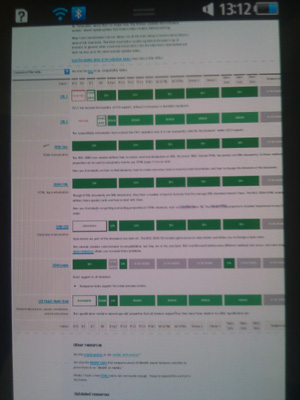
Here’s my compatibility master page as it should display on mobile (Dolfin on Samsung Wave). Note that the text in the table stretches all the way from left to right, as it should:
And here is the same page on Opera Mobile 10.10 (Nokia N97). Here the text in the table is narrowed to the width Opera is going to take later on, when you zoom in:
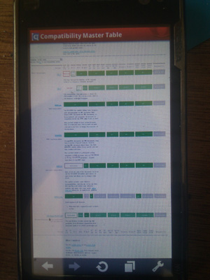
In this particular case I don’t mind much, but this feature has the ability to completely destroy a well-designed page. As far as I know you can’t do anything against this effect and will have to accept the damage it does to your page.
But by far the worst feature of Opera’s zoom is the user interaction. On touchscreens an industry standard is emerging for zooming. You either pinch-zoom or you double-tap. Some browsers don’t support pinch-zoom, but the double-tap works pretty well, too.
However, Opera in its wisdom uses not a double-tap but a single-tap interface. Tap once when zoomed out and you will zoom in on roughly the area you tapped on.
This is terrible. In order to understand why, take a look at my Touch test page. It’s fully zoomed-out:
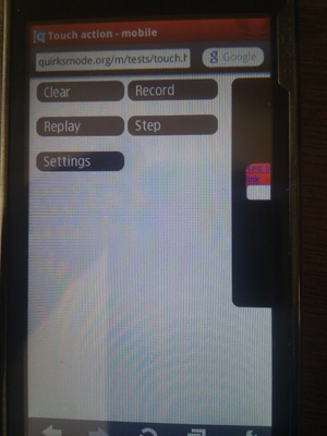
This is how I designed the page: I want it to be usable even fully zoomed-out. Thus I can load the page, hit Record, and record an event sequence of my choice.
But what happens in Opera Mobile when I hit Record with a single tap in order to start recording? It. Bloody. Zooms. In! That makes my test page much harder to use.
To be fair, Opera Mobile 10.10 does not zoom at all in pages that have a <meta viewport>, as my test page has. That solves this particular issue, but I feel it’s still a stop-gap solution. All other browsers do allow the user to zoom in on a <meta viewport>-enhanced page. (Some even allow you to zoom out.)
Concluding, Opera Mobile has a serious zoom problem that must be addressed in addition to the touch event and viewport dimension problem.
I feel that addressing these issues is more important than yet another faster JavaScript engine or yet another UX upgrade. Besides, as long as zoom remains lousy the UX can be upgraded only so much. Zooming is a fundamental part of the mobile UX; without it many other innovations just don’t make sense.
So in order to remain relevant on the highest tier of mobile browsing, Opera will have to concentrate on three things:
I more-or-less expect the busy engineers in Oslo to be working on these problems, and I assume that the next major Opera Mobile upgrade will bring significant improvements here.
If it doesn’t, I’m afraid Opera is out of the race for the top spot. That is not necessarily bad: it could always forget about the top tier and instead concentrate on the low-end smartphone market. Right now Opera Mobile is available only for Symbian and Windows Mobile, and on those operating systems it’s the best available browser.
Without a serious upgrade of mobile-specific functionality ruling this second tier is the best Opera can hope for. The top tier will be WebKit-only.
This is the blog of Peter-Paul Koch, web developer, consultant, and trainer.
You can also follow
him on Twitter or Mastodon.
Atom
RSS
If you like this blog, why not donate a little bit of money to help me pay my bills?
Categories:
Comments are closed.
1 Posted by bruce on 28 July 2010 | Permalink
"I more-or-less expect the busy engineers in Oslo to be working on these problems"
They are!
2 Posted by Mike Cardwell on 28 July 2010 | Permalink
It doesn't support line-height either! Madness. It's the only browser I've found so far that my current project looks bad on because it doesn't support line-height. Crazy.
3 Posted by Mike Cardwell on 28 July 2010 | Permalink
FYI, the "Homepage" field in your comments form breaks https urls. I actually entered "https://secure.grepular.com/" but it converted it to "http://https//secure.grepular.com/"
A quirk? ;)
4 Posted by Jani Hartikainen on 28 July 2010 | Permalink
There are two things here that aren't correct in my experience:
One: Opera Mobile requires a double-tap to zoom in. Unless they've recently changed it, of course.
I have it on WinMo and have used it on N97 and in both instances it required two taps to zoom in.
Two: Opera Mobile has more than two zoom levels. On HTC's Touch Diamond you can use the touch-wheel thing to zoom in/out gradually. It seems that it's been constrained to fully zoomed in/out on most devices since as far as I know there is no multitouch (eg. pinch zoom) support yet.
5 Posted by kl on 28 July 2010 | Permalink
I think you exaggerate with viewport detection. It may be crucial to your mobile-only advanced pages, but most pages on the net, including even "mobile optimized" don't do such fancy things and stick to standard single-layer scrolling.
6 Posted by Frans on 28 July 2010 | Permalink
Opera on the HTC Touch Diamond 2 doesn't seem to suffer from the behavior you complain about with the zooming (both regarding "only two levels" and the single-click zooming). The text-column behavior is something I thoroughly enjoy because I know exactly what's going to happen when I zoom in, rather than wondering whether I'll be faced with horizontally scrolling text when I do. I'm sure you can change it somewhere to behave more desktop-like, but I consider that a weakness of Webkit, not a strength.
Regarding touch events, I have to agree with the comment at http://www.quirksmode.org/blog/archives/2010/02/do_we_need_touc.html#c13353
I feel that if anything, implementing this on websites rather than system-wide will only result in individual differences between websites and widgets (if ever so tiny), plus a lot of extra work for web developers that seems unnecessary.
7 Posted by Michal on 28 July 2010 | Permalink
I recently installed Opera Mobile on my HTC Tattoo (Android 1.6), and while I have to admit I was at first annoyed at the two-step zoom, I learned to like it and now regard it the best browsing experience available on my phone. The fact that it renders pages mind-blowingly faster than the stock browser is huge, but overall I realised that when it comes to pages I am actually willing to load up on my little screen, I couldn't care less if they are rendered properly or not. I want to access my information fast and hassle-free, and nothing seems to be doing this better on my phone than Opera Mobile.
8 Posted by Rafael on 28 July 2010 | Permalink
You simply said the features you need Opera to implement to make your pages looks and works better and to make your experience better.
Boo.
PS: I was unable to post a comment using Opera 10.60 @ Windows 7.
9 Posted by atmozphere on 28 July 2010 | Permalink
Michal you are refering to Opera Mini.
Yeah, I actually prefer how the android browser does it, the text is dynamicaly adjusted to the screen width (reflown) as you zoom in/out. On the same note I totallu give opera credits for introducing the zoomed out view when the page is downloaded. It drives me crazy that s60 web doesn't do the same thing. Zooming is absolutely one of the most important features on a mobile browser. Though I love symbian I moved to android for a sole reason of the browser.
10 Posted by Steve Clay on 29 July 2010 | Permalink
I find the iPhone's pinch zoom to be a clunky experience requiring multiple attempts with horizontal scrolling on real world pages.
Having a reliable one-try zooming experience (assuming it's not single-tap) to immediately legible line lengths would be an improvement. I haven't tried Opera mobile, but those little things that might annoy layout designers might really please end users.
11 Posted by Frans on 29 July 2010 | Permalink
@10, Steve:
Very good point. I recently demonstrated how well someone's site functioned on Opera Mobile after they claimed it didn't work on mobile at all (and wasn't supposed to either, fixed layout etc.). They exclaimed how that messed up the layout and it was precisely what they were talking about. Personally, all I saw was legible, usable content that looked very good. Sure, it didn't look precisely like the desktop, but that was mostly regarding the header image, and who wants horizontal scrolling? Heck, even on desktop I use Opera's fit-to-width feature all the time because authors think they should control my browsing experience more than I should.
12 Posted by Ayyash on 4 August 2010 | Permalink
I should have read this article before I started working on our current web-app! I had to discover the atrocities on my own! Not only touch events are not supportd, i tried mousedown and mouse up, they fire collectively with click :( no way around it, no way out of it
13 Posted by Jonas Höglund on 16 August 2010 | Permalink
"Right now Opera Mobile is available only for Symbian and Windows Mobile"
It works on the Maemo platform as well (even though that's a small part of the market of today).
14 Posted by Jay Guire on 10 November 2010 | Permalink
I also have a problem the scrolling, albeit not the same as you mentioned.
Attempting to create a table with its own vertical scroll bar just does not work. The table is presented at its full size. Sure, the whole screen can then be scrolled, but that is not the desired effect.
This problem isn't device dependent because I have tested my page (and countless variations of it) in the Opera Mobile Emulator. By the way, the full version of Opera correctly displays the page.