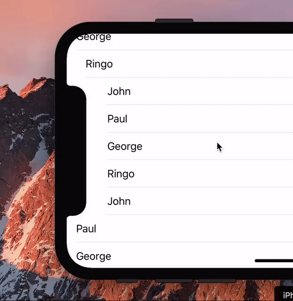
During the introduction of the iPhone X a hilarious gif made the Twitter rounds, showing a list scrolling past the new notch.
I asked the question any web developer would ask: “Hey, is this even possible with web technology?” Turns out it is.
(We should probably ask: “Hey, is this a useful effect, even if it’s possible?” But that’s a boring question, the answer being Probably Not.)
So for laughs I wrote a proof of concept (you need to load that into the iPhone X simulator). Turns out that this little exercise is quite useful for wrapping your head around the visual viewport and zooming. Also, the script turned out to be quite simple.
I decided to give this script an old-fashioned line by line treatment like I used to do ten years ago. Maybe it’ll help someone wrap their head around the visual viewport, and performance, and potential viewport-related browser incompatibilities.
First, let’s repeat some definitions:
<meta name="viewport" content="width=device-width,initial-scale=1"> The demo page does so.See my viewports visualisation app for an overview of how all this stuff works in practice.
This is the CSS I use:
li {
	font-size: 9px;
	border-top: 1px solid;
	border-width: 1px 0;
	margin: 0;
	padding: 3px 0;
	padding-left: 10px;
	transition-property: padding;
	transition-duration: 0.2s;
}

li.notched {
	padding-left: constant(safe-area-inset-left);
}
Note the constant(safe-area-inset-left); it is a (for now) Apple-only CSS constant that gives the notch’s offset (44px, if you’re curious). There is some talk of renaming this to env(...) and making it a cross-browser feature, but that will take a while. For now it only works on the iPhone, and we use it as such in this example script.
The purpose of the script is to change the class names of LIs that are next to the notch to notched. That changes their padding-left, and we also give that change a nice transition.
window.onload = function () {
	allLIs = document.querySelectorAll('li');
	if (hasNotch()) {
		window.addEventListener('orientationchange',checkOrientation,false);
		setTimeout(checkOrientation,100);
	} else {
		allLIs[0].innerHTML = 'Not supported. View on iPhone X instead.';
	}
}
First things first. Create a list allLIs with all elements (in my case LIs) that the script is going to have to check many times.
Then check for support. We do this with the hasNotch() function I explained earlier. If the device has a notch we proceed to the next step; if not we print a quick remark.
Now set an orientationchange event handler. The script should only kick in when the notch is on the left. After we set the event handler we immediately call it, since we should run a check directly after the page has loaded instead of waiting for the first orientationchange, which may never occur.
There’s an oddity here, though. It seems as if the browser doesn’t yet have access to the new dimensions of the visual viewport and the elements until the JavaScript execution has fully come to a stop. If we try to read out data immediately after the orientationchange event (or, in fact, the scroll event), without giving the Javascript thread an opportunity to end, it’s still the old data from before the event.
The solution is simple: wait for 100 milliseconds in order to give the browser time to fully finish JavaScript execution and return to the main thread. Now the crucial properties are updated and our script can start.
function checkOrientation() {
	if (window.orientation === 90) {
		window.addEventListener('scroll',notchScroll,false);
		setTimeout(notchScroll,100);
	} else {
		window.removeEventListener('scroll',notchScroll,false);
		for (var i=0,li;li=allLIs[i];i+=1) {
			li.classList.remove('notched');
		}
	}
}
Checking the orientation is pretty simple. If window.orientation is 90 the phone has been oriented with the notch to the left and our script should kick in. We set an onscroll event handler and call it, though here, too, we should observe a 100 millisecond wait in order to give the properties the chance to update.
If the orientation is anything other than 90 we remove the onscroll event handler and set all elements to their non-notched state.
The main script is called onscroll and checks all elements for their position — and yes, every element’s position is checked every time the user scrolls. That’s why this script’s performance is not brilliant. Then again, I don’t see any other way of achieving the effect, and I heard rumours that a similar technique performs decently on iOS. Anyway, we can’t really judge performance until the actual iPhone X comes out.
var notchTop = 145;
var notchBottom = 45;
Before we start, two constants to store the notch’s top and bottom coordinates. There are two important points here:
Now we’re finally ready to run the actual script.
function notchScroll() {
	var zoomLevel = window.innerWidth/screen.width;
	var calculatedTop = window.innerHeight - (notchTop * zoomLevel);
	var calculatedBottom = window.innerHeight - (notchBottom * zoomLevel);
The crucial calculations. We’re going to need the current zoom level: visual viewport width divided by ideal viewport width. Note that we do not use heights here, again in order to avoid incoming or exiting toolbars. Width is safe; height isn’t. (Still, there’s an oddity here in Safari/iOS. See below.)
Now we recast the notch coordinates from relative-to-bottom to relative-to-top. We take the current height of the visual viewport and subtract the notch coordinates relative to the bottom, though we first multiply those coordinates by the zoom level so that they stay in relative position even when the user zooms.
The beauty here is that we don’t care if the browser toolbar is currently visible or not. The visual viewport height is automatically adjusted anyway, and our formula will always find the right notch position.
	var notchElements = [];
	var otherElements = [];
	for (var i=0,li;li=allLIs[i];i+=1) {
		var top = li.getBoundingClientRect().top;
		if (top > window.innerHeight) break;
		if ((top < calculatedBottom && top > calculatedTop)) {
			notchElements.push(li);
		} else {
			otherElements.push(li);
		}
	}
Now we loop through all elements and find their positions. There are several options for finding that, but I use element.getBoundingClientRect().top because it returns coordinates relative to the visual viewport. Since the notch coordinates are also relative to the visual viewport, comparing the sets is fairly easy.
If the element’s top is between the notch top and notch bottom it should be notched and we push it into the notchElements array. If not it should be un-notched, which is the job of the otherElements array.
Still, querying an element’s bounding rectangle causes a re-layout — and we have to go through all elements. That’s why this script is probably too unperformant to be used in a production site.
There’s one fairly easy thing we can do to improve performance: if the element’s top is larger than the visual viewport height we quit the for loop. The element, and any that follow it, are currently below the visual viewport and they certainly do not have to be notched. This saves a few cycles when the page has hardly been scrolled yet.
	while (notchElements.length) {
		notchElements.shift().classList.add('notched');
	}
	while (otherElements.length) {
		otherElements.shift().classList.remove('notched');
	}
}
Finally, give all to-be-notched elements a class of notched and remove this class from all other elements.
There’s a fairly important caveat here. I moved the actual assignment of the classes outside the for loop, since this, theoretically, would increase performance as well. There are no actual style changes during the loop, so we can hope the browsers don’t do a re-layout too often. (To be honest I have no clue if Safari/iOS does or doesn’t.)
This sounds great, but there’s a problem as well. Notched elements get a larger padding-left, which, in real websites, might cause their content to spill downward and create new lines, which makes the element’s height larger. That, in turn, affects the coordinates of any subsequent elements.
The current script does not take such style changes into account because it’s not necessary for this demo. Still, in a real-life website we would have no choice but to execute the style changes in the main loop itself. Only then can we be certain that all coordinates the script finds are correct — but at the price of doing a re-layout of the entire page for every single element.
Did I mention that this script is just for laughs, and not meant to be used in a serious production environment? Well, it is.
This script is custom-written for Safari/iOS. That’s fine, since the iPhone X is the only phone with a notch. Still, I would like to point out a few interesting tidbits.
getBoundingClientRect is relative to the visual viewport in some browsers, but relative to the layout viewport in others. (Details here.) The Chrome team decided to make it relative to the layout viewport instead, which means that this script won’t work on Chrome.
As an aside, it likely will work in Chrome/iOS and other iOS browsers, since these browsers are a skin over one of the iOS WebViews (always forget which one). Installing competing rendering engines is not allowed on iOS. That is sometimes bad, but in this particular case it’s good since it removes a major source of browser compatibility headaches.
Speaking of Chrome, in modern versions of this browser window. gives the dimensions of the layout viewport, and not the visual one. As I argued before this is a mistake, even though Chrome offers an alternative property pair.
Then the notch coordinates. Frankly, it was only during the writing of this article that I realised they do not use any known coordinate system. You might think they use the visual viewport coordinate system, and they kind of do, but it’s a weird, iOS-only variant.
The problem is that, only in Safari/iOS, screen.width/height always give the portrait dimensions of the ideal viewport. Thus, the zoom level of the actual, current landscape width is calculated relative to the ideal portrait width. That sounds weird but it doesn’t give any serious problems, because we use it throughout the script, and I (unconsciously) calculated the notch coordinates relative to this weird coordinate system as well.
Bottom line: this, again, would be a serious incompatibility headache in any cross-browser script, but because we’re only targeting Safari/iOS we don’t have any problems.
Still, I hope these two examples show that unilaterally changing the coordinate spaces of some viewport-related JavaScript properties is a bad idea. The situation is complicated enough as it is, and you never know what’s going to break.
This is the blog of Peter-Paul Koch, web developer, consultant, and trainer.
You can also follow
him on Twitter or Mastodon.
Atom
RSS
If you like this blog, why not donate a little bit of money to help me pay my bills?
Categories: