JavaScript archives
Compatibility
Thidrekssaga
QuirksBlog
Donations
CSS book
Politics
Mobile
About
COH
Yesterday I stumbled upon one case in which some mobile Chromes change the font size of elements without having been ordered by the CSS. This article gives a quick overview.
My test is incomplete and will likely remain so, since these changes only occur in fairly unusual circumstances, and spending days and days of research time seems wasteful. Nonetheless I want to leave a note for researchers who come after me.
See the two screenshots below of this and this page, taken on Chrome 43 on an HTC M8. The only CSS on these pages sets the width of the test boxes. The same effect occurs on the Samsung Chromium 34, but not necessarily on all Chromia. In particular, Opera 30 does not have this behaviour.
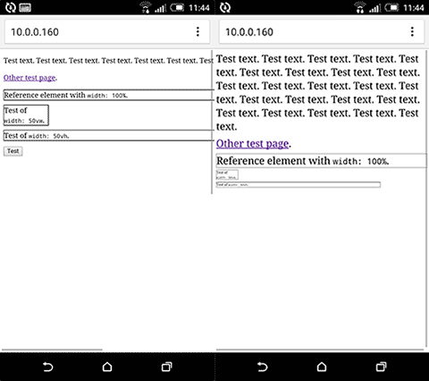
As you see the font sizes are different. In particular, in the screenshot on the right the font size of the last two boxes is significantly smaller than the one of the first box and the text above, even though the CSS does not contain any font-size declaration and the font size should hence be 16px everywhere.
As far as I can see this behaviour takes place when three specific circumstances occur:
Circumstance 1, in particular, is rare. Usually a site is either responsive or has a desktop layout. That’s the reason I decided not to continue this avenue of research. It would likely take me days to figure out the exact values and circumstances, and once I’m done the results will have little practical applicability.
Update: A follower sent me this Google document about text autosizer, which appears to be what's happening here.
Safari behaves differently: it always shows the middle box (the narrowest) in a smaller font, even if the page has a desktop layout, and regardless of the height of the other elements on the page. The narrowest box has a font size equal to the other text when a meta viewport is applied, though.
I intended to provide a screenshot, but as usual it was totally fucking impossible to get a photo off my iPhone and on to my computer. Apple fail.
This is the blog of Peter-Paul Koch, web developer, consultant, and trainer.
You can also follow
him on Twitter or Mastodon.
Atom
RSS
If you like this blog, why not donate a little bit of money to help me pay my bills?
Categories: