The Grid Layout spec is the most succesful attempt at introducing grids in CSS because it’s actually implemented in IE10. See also the Microsoft documentation.
This page uses all four vendor prefixes as well as the unprefixed versions. Below I only show the unprefixed code.
Here’s a slightly annotated example.
The outer div has
display: grid;
grid-columns: 150px 150px 150px;
grid-rows: 150px 150px 150px;
Here we define that the outer div is a grid container, and the width of the columns and height of the rows. It’s also possible to use auto here, or to use 1fr, 2fr etc. fr means fraction, and the available space is divided among them.
For instance, this would make the middle column 200px wide, and divide the rest of the available space 2-to-1 between right and left:
grid-columns: 1fr 150px 2fr;
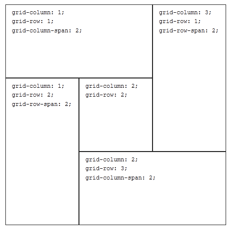
For each grid unit you have to define what the start column and row is (starting from top-left), and whether it spans several columns or rows.
grid-column: 1;
grid-row: 1;
grid-column-span: 2;
grid-column: 3;
grid-row: 1;
grid-row-span: 2;
grid-column: 2;
grid-row: 2;
grid-column: 1;
grid-row: 2;
grid-row-span: 2;
grid-column: 2;
grid-row: 3;
grid-column-span: 2;
This is how it’s supposed to look: